I joined to design a billing flow. I left having designed the product.
How I led design across a transaction-monitoring platform: from a visual rules engine to case management to the design system underneath, at a Techstars-backed fintech in Lagos.
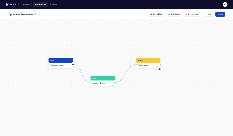
Fast enough to catch fraud. Defensible enough to survive an audit.
Hatari's customers (banks, fintechs, lenders) have to make a yes/no call on a payment in milliseconds, then defend that call to a regulator months later. That double bind: fast and defensible — is the whole problem.
And underneath: the parts I was asked to design (onboarding, subscriptions, team management) had no product to attach to yet. Hatari was being spun out as a standalone product, and the existing foundation didn't reach the dense, specialised screens this one would be made of.
I didn't start from assumptions.
Discovery drew on interviews with target users (representatives from banks, fintechs, and online businesses), analysis of support tickets against Voyance's existing authentication and billing flows, and a read of competitor tools and where they frustrated people.
What I learned changed the design in two ways:
Before screens, I set a few principles so the later decisions weren't arbitrary:
The rules engine: the decision the product turned on
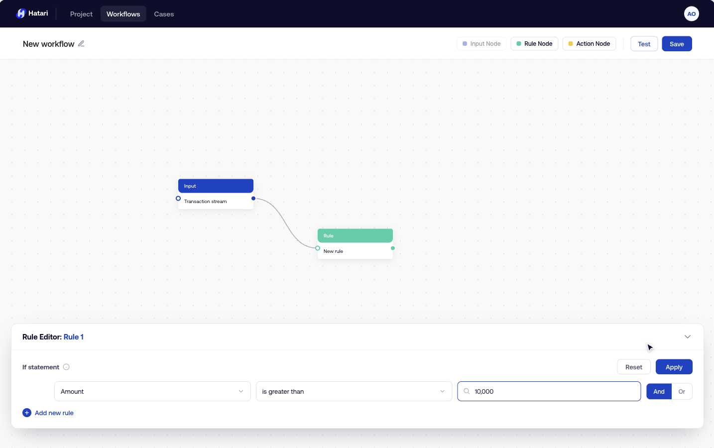
Let a compliance analyst (not a developer) compose real-time logic over a live stream of transactions, and have it feel authorable and auditable rather than like writing a program. I weighed two approaches:
A conventional stack of IF / AND / THEN condition rows. Familiar, quick to build, and fine for a single simple rule.
But it hides the logic: once a policy has more than a couple of conditions, a flat list stops telling you what actually happens, in what order, to what. That's the opposite of auditable.
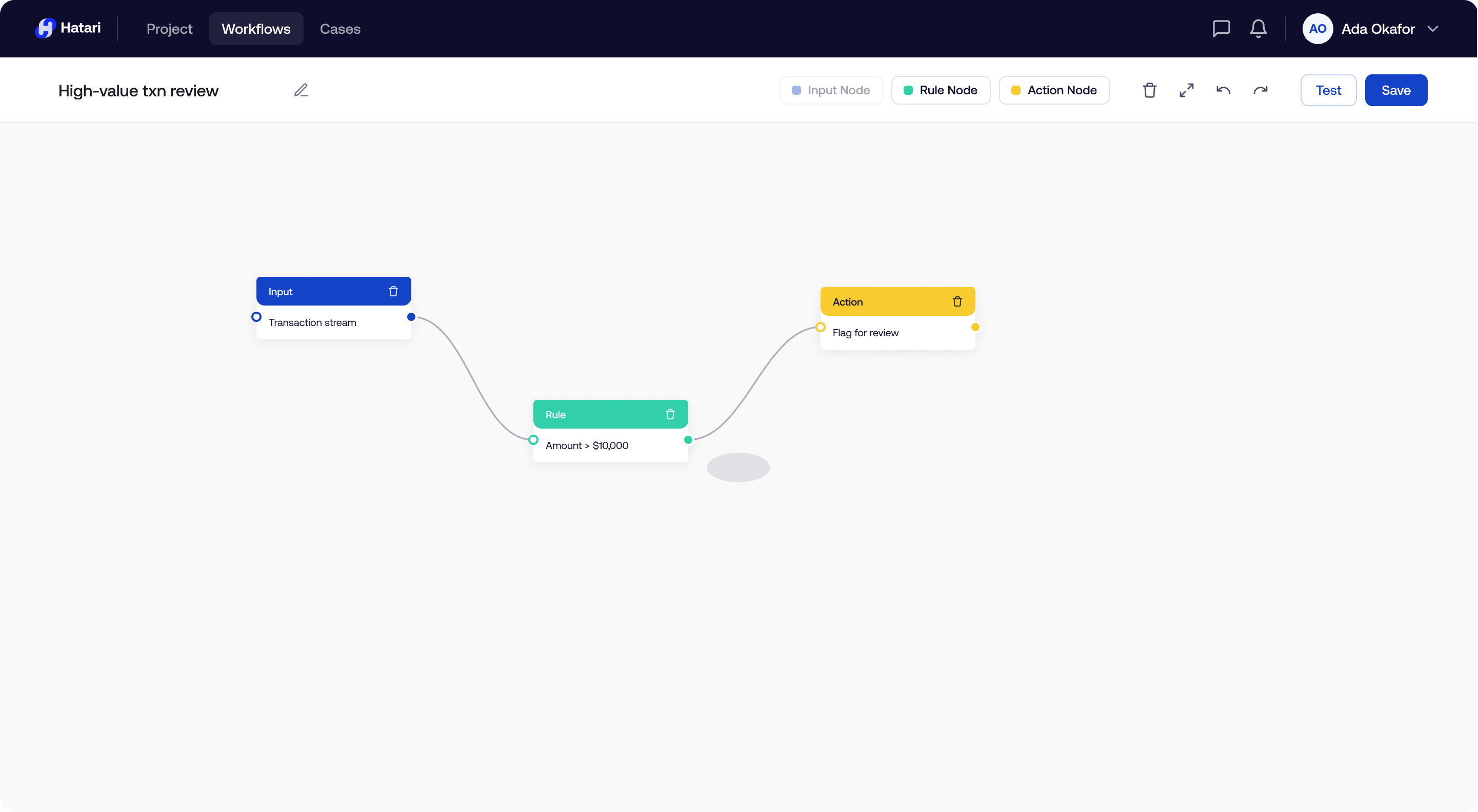
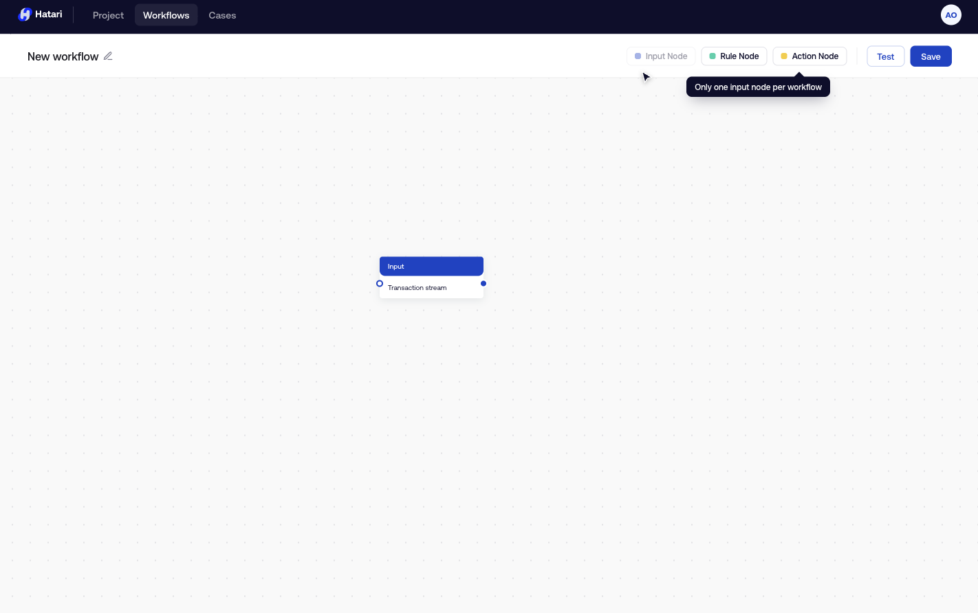
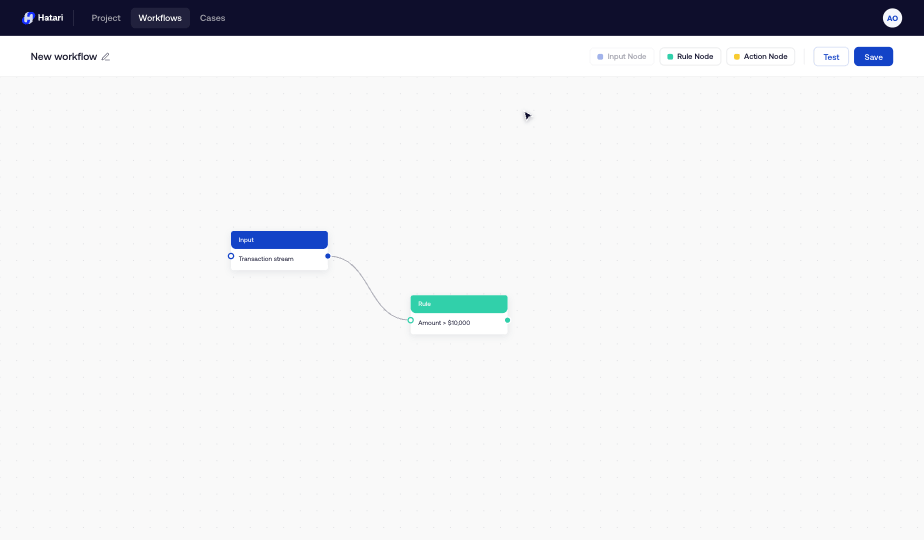
✗ Not chosenA visual pipeline: input → rule → action nodes wired together on a canvas, with each rule's logic written in plain "If / Then" language.
Stream processing already behaves like a pipeline, so the canvas matches the mental model and shows the whole decision path at a glance, which is exactly what auditability means. The trade-off: harder to build, a steeper first five minutes. I spent the effort buying that cost down.
✓ Chosen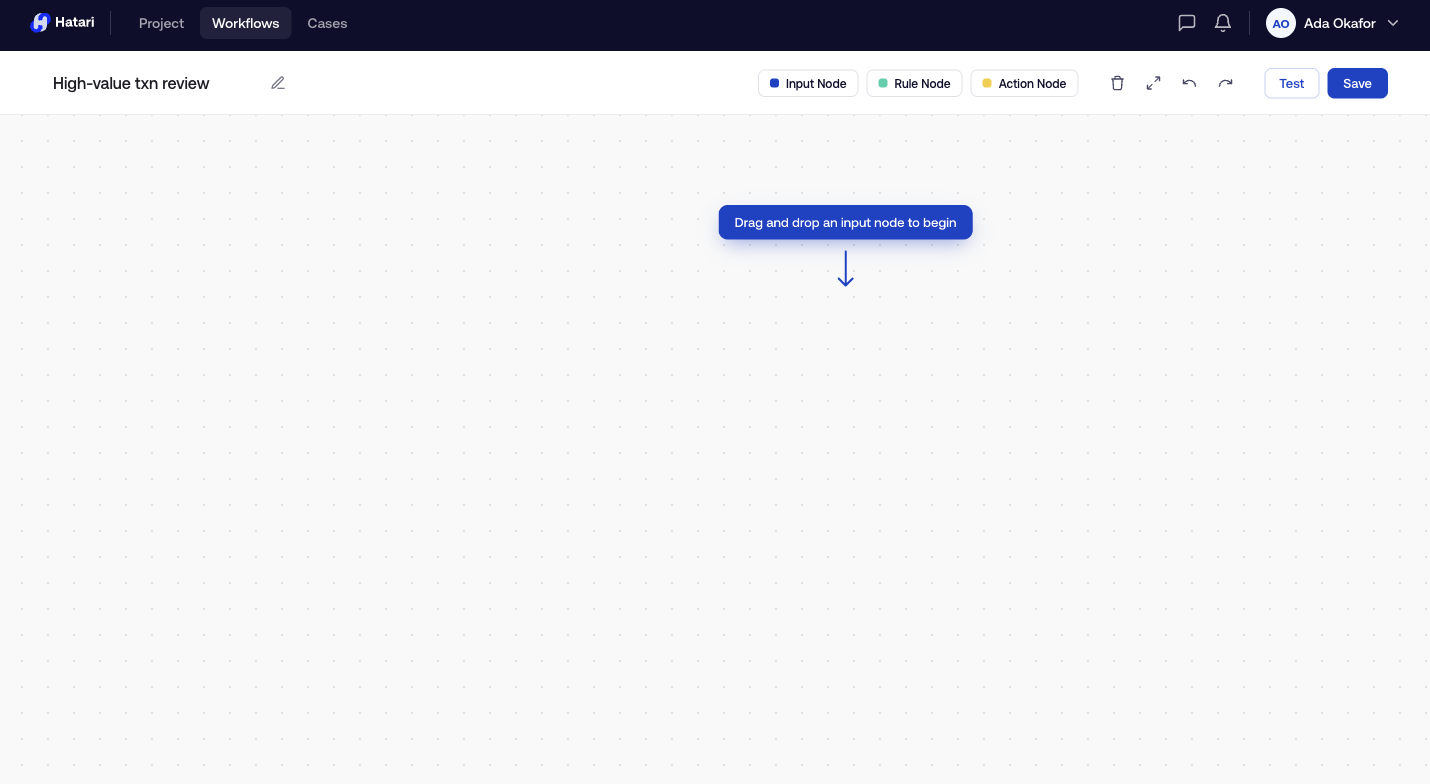
Every other surface I designed, as a decision.
The rules engine was the heart of Hatari, but three more surfaces had to be just as considered for the product to hold together. Each one came down to a single decision.
Design the case queue as a workspace, and make permissions explicit.
{{ a.body }}
Make a model's decay legible to people who aren't data scientists.
{{ a.body }}
Treat billing as a clarity-and-control problem, not a visual one.
{{ a.body }}
Designing for handoff as its own problem.
With a team split across time zones, an engineer often couldn't ask me a question synchronously, so the answer had to already be on the canvas. I left designer's notes documenting interaction logic: that deleting a rule is undoable, that exiting with unsaved changes warns you first, that a filtered list shows a recovery banner before it's gone.
From capability to product.
Hatari went from a borrowed, general-purpose foundation to a coherent, shippable, sellable product with its own system, across every surface a customer touches. Early customers included Dojah and AjoCard, and the product was generating recurring revenue by the time it went to market.
The business outcome belongs to the team. I include it as proof Hatari became real, not as something my design caused.
A standalone product where there had been a capability.
I designed every surface a customer touches. Here is the full scope of what I owned, end to end:
I didn't do it alone. Our product manager owned requirements, go-to-market, and customer relationships. The ML engineers owned the models I was designing an interface around. Frontend engineers built it across time zones, and a lot of my design decisions were shaped by what would translate cleanly into code without me in the room. There was also a design lead at Voyance I checked direction with.
My job was to be the person holding the whole product's design together. It was still a team's product.
"Aderinsola was the key force behind our Hatari project, and also did great work updating our design system."
— Design Team Lead, Voyance"She knows when to stand her ground and defend UX and design decisions. Her ability to handle edge cases and iterate on the fly is stellar."
— Olayinka Oloko, Product ManagerWhat I learned from designing a high-stakes product.
Treating scope as something to find rather than accept. The honest unit of work was never "billing"; it was "a product a team can trust with high-stakes decisions."
How much of good design in a high-stakes tool is deceleration: the undo banners, the unsaved-changes guards, the constraint that disables itself. I came in thinking my job was to make things faster; a lot of the most important work was making the dangerous things slower.
Get the rules-builder mental model in front of real compliance analysts earlier and more often. It's the surface most likely to make or break adoption, and it deserved the most outside contact with actual users.
I stopped treating empty, error, and loading states as cleanup at the end. On Hatari they carried as much of the product's trustworthiness as the happy path, and I've designed states-first ever since.