HustleSasa Events — Aderinsola Adejuwon
Ask me about this project...

Ask about this project

Powered by Claude AI
Try asking:
How does this app fit into the HustleSasa ecosystem?
Why a three-step checkout instead of a single page?
How did you design the post-purchase ticket experience?
What was the hardest design decision on this project?
← Back to home Aderinsola Next project →
HustleSasa Events

Designing a ticket management app that became something bigger.

How a ticket management brief became a full native mobile app for discovering and attending live events across East Africa, from passwordless sign-up to QR venue entry.
Role Product Designer
Company HustleSasa
Platform iOS · Android
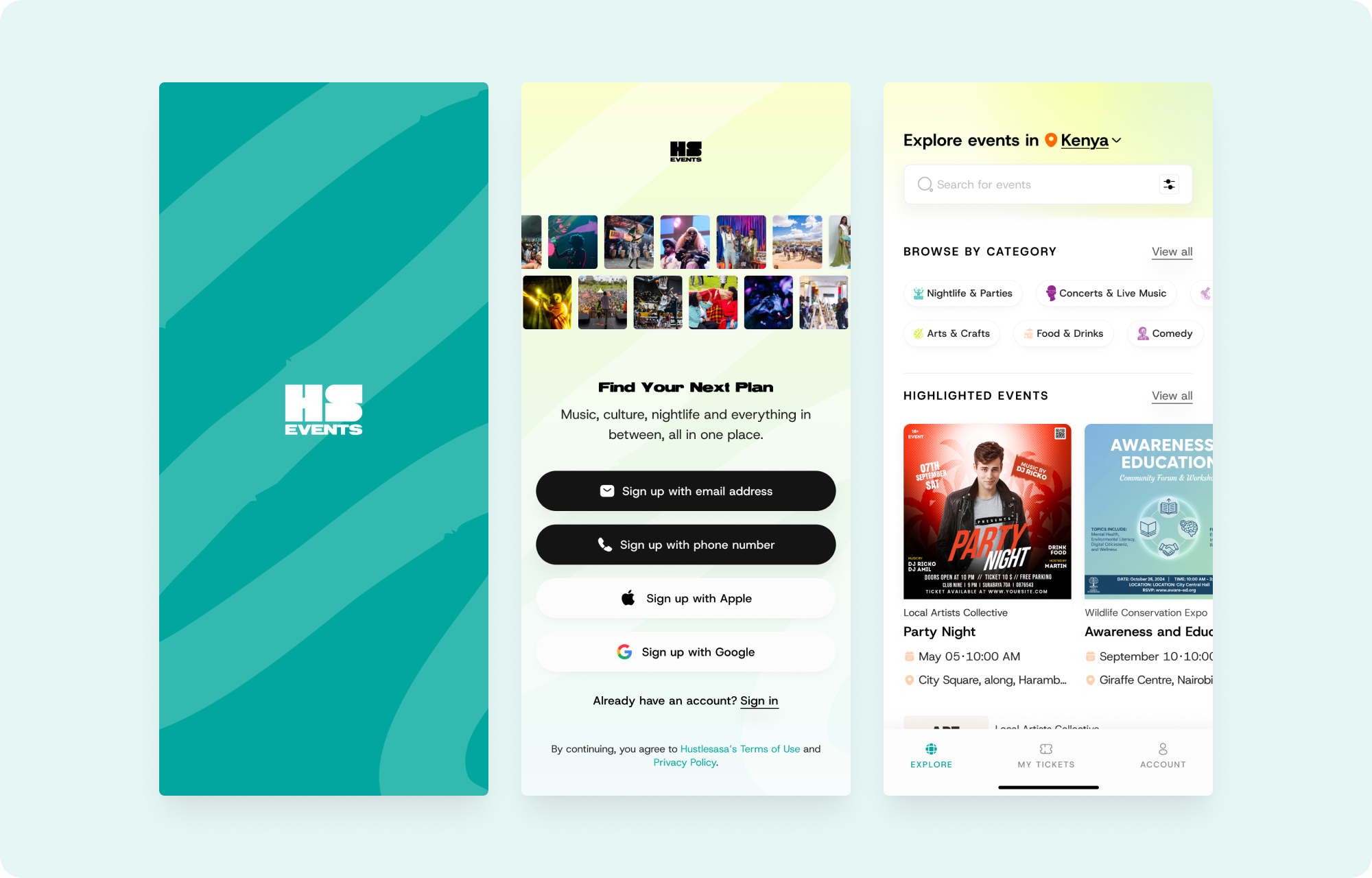
HustleSasa Events app: Splash screen, Get Started sign-up hub, and Explore events home
My Role

Sole designer. End to end.

I was the only designer on this product. That meant owning everything from initial research through to the final component spec that engineers built from. Specifically:

Product strategy: Identified the scope expansion from ticket management to full attendee experience. Wrote the product brief and defined the feature set.
UX research: Competitive analysis, user interviews, and support-ticket review to understand what attendees actually needed.
Interaction design: All flows, wireframes, and high-fidelity prototypes. Every screen and every state.
Visual design: Color system, typography, component library, and the brand-energy strategy that resolved nightlife personality with checkout calm.
Design system: Built and maintained the component library that engineers referenced directly.
Developer handoff: Annotated specs, edge-case documentation, and state matrices for every flow.

The PM defined priorities and managed stakeholder alignment. The three mobile engineers (iOS, Android, backend) built from my specs. I worked directly with them on implementation questions, particularly around state management and animation timing.

The Problem

It started with ticket management. The opportunity turned out to be bigger.

The original ask was straightforward: build a mobile app where attendees could manage their tickets. Store them, scan QR at the venue, share them with friends. We already had a web marketplace, but no native attendee app at all.

When I looked at that brief, I saw the gap: building an entire app just for ticket management felt incomplete. We had no buyer-side mobile experience. Meanwhile, if you're someone who just landed in Nairobi and you're trying to figure out what's happening this weekend, there's no single place to go. Plenty of platforms manage ticketing, but very few handle event discovery well.

So I expanded the scope: not just ticket management, but a full attendee experience. Discovery, purchase, and ticket lifecycle, all in one native app. The merchant tools (event creation, dashboard) already existed as separate products. This app would be where those events meet the people who attend them.

I presented the expanded scope to the PM and engineering lead with a competitive analysis and rough wireframes. After reviewing the opportunity, the team aligned on pursuing the full attendee app rather than the narrower ticket-only version.

Discovery

What research told me before I designed anything.

Before opening Figma, I spent time understanding how people actually find, buy, and attend events in East Africa. Three inputs shaped the product:

Competitive analysis I looked at Eventbrite, Dice, Ticketmaster, and regional players like mTicket. The pattern was clear: most apps are transaction tools, not discovery tools. They assume you already know what you want. None solved the "what's happening this weekend?" question well, especially for a mobile-first African audience.
User interviews I spoke to 8 regular event-goers in Nairobi and Dar es Salaam. What came through consistently: people discover events through Instagram Stories and WhatsApp group chats, not search. They buy tickets on their phones, usually within 48 hours of the event. And they almost always buy for more than one person.
Support ticket review I reviewed three months of support requests from the existing web marketplace. The top issues: "where is my ticket?", "how do I send my ticket to my friend?", and "the event page doesn't load on my phone." These weren't feature requests. They were signals about what the product was missing entirely.

"The key finding wasn't about features. It was about timing."

Most purchases happen within 48 hours of the event. That meant the app couldn't just list events chronologically; it needed to surface what's happening now and next. That insight directly shaped the date-grouped home screen and the "Today / Tomorrow / This Weekend" filter pattern.

Target Users

Urban, mobile-first, plans socially.

The Spontaneous Planner "What's on tonight?" Date-grouped lists (Today / Tomorrow / This weekend) and quick date filters support the user who decides in the moment.
The Repeat Buyer First-time users enter their details once. Returning users get everything pre-filled. That small difference has outsized impact on the people most likely to come back.
The Social Attendee Buys for the group, shares tickets to friends by name, email, and phone. The product is built around groups, not just solo buyers.
Design Principles

Six principles shaped every screen.

Discovery should be effortless Browse by category, location, and date instead of needing to know exactly what you want.
Remove sign-up friction Passwordless, multi-option auth so the barrier to a first purchase is as low as possible.
Build confidence before purchase Rich detail pages (poster, mapped venue, organizer, clear ticket tiers) before asking for payment.
Fit local behavior WhatsApp verification codes and mobile-money payments alongside cards.
Own the whole lifecycle Not just the sale, but the ticket: QR entry, a clear used state, and the ability to share tickets with friends.
Feel trustworthy Biometric quick-access, polished brand moments, and careful handling of states and destructive actions.
Exploration

The paths I considered and the ones I rejected.

Before settling on the current product shape, I explored several approaches. Some were dead ends. Others clarified what mattered.
❌ Map-first discovery I wireframed a version where the home screen was a map showing events near you. It looked compelling but failed for two reasons: most users in Nairobi don't think about events spatially (they think about what kind and when), and map rendering on lower-end Android devices was slow enough to feel broken.
❌ Social feed model I explored a feed-based discovery (friends are attending, you might like) similar to Dice. But we didn't have the social graph data to power it, and building that would have delayed the product by months. I chose category-and-time browsing because it works without a network effect.
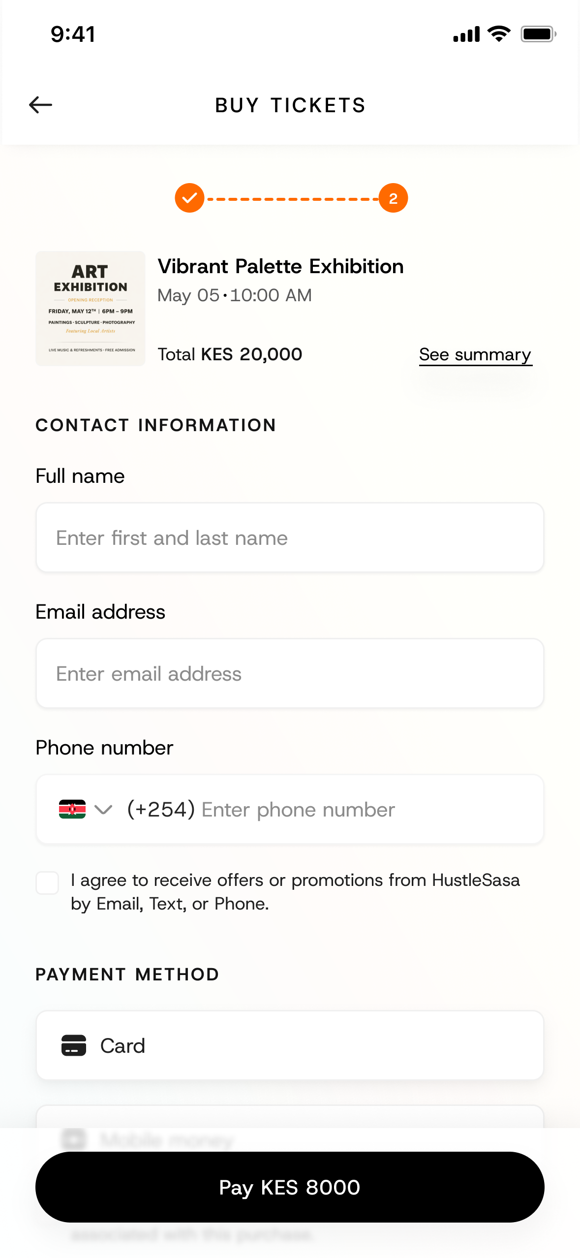
✓ Single-page checkout vs. multi-step I prototyped both. The single-page version looked cleaner but felt overwhelming on mobile, especially with ticket tiers, contact details, and payment methods visible at once. The three-step approach with a progress indicator reduced cognitive load at the highest-anxiety moment: handing over money.
Three-step checkout screen: contact information and payment method (Card / Mobile money) under a step progress indicator
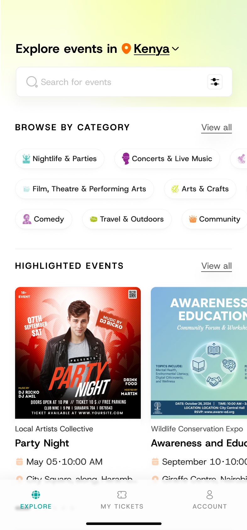
✓ Bottom tab bar vs. hamburger menu Not a close call: Explore, Tickets, and Account needed to be one tap away at all times. A hamburger would have hidden the core product behind a drawer. Bottom tabs also gave me a place to surface "My Tickets" as a persistent badge count.
Explore events home with the persistent bottom tab bar: Explore, Tickets, and Account always one tap away
Key Flows

Six journeys, one product.

The app spans the full lifecycle of attending an event. Each flow was designed as a complete journey, not isolated pages.

{{ s.alt }}
{{ f.caption }} {{ f.counter }}
{{ f.eyebrow }}

{{ f.title }}

{{ a.label }} {{ a.sign }}

{{ a.body }}

Design Decisions

The UX decisions that shaped the product.

Passwordless, multi-option auth Email, phone, Apple, and Google sign-up, verified through a WhatsApp code or email magic link. No passwords. Passwords are a known drop-off point, and in these markets WhatsApp is a near-universal, trusted channel.
Discovery built around category, place, and time The Explore home leads with a location selector and category browser, then curated rails. Event-going is inherently about when and where, so the IA is built around those axes rather than a single search box.
A purchase flow that adapts to who you are Returning users see their contact details pre-filled. First-time users fill them in once. This removes repeated data entry for the people most likely to buy again, while keeping the first purchase straightforward.
The ticket is part of the product, not the end of it After purchase, My Tickets handles real-world use: a QR code to scan at the venue, the ability to hide/show that code, a clear "this ticket has been used" state, and a flow to share a ticket to a friend's details. Designing the post-purchase life of a ticket is what makes the app feel complete.
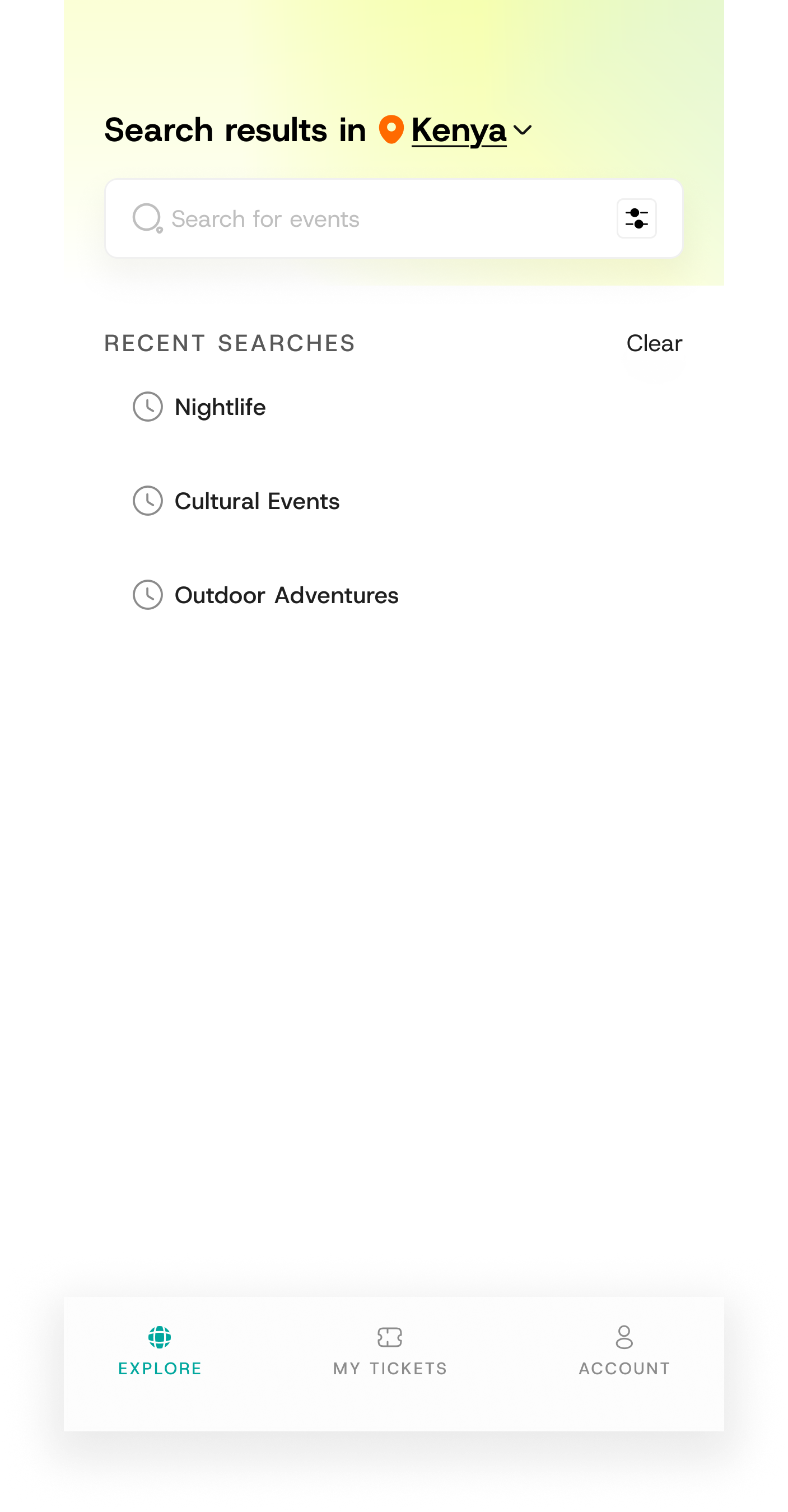
Recovery designed into dead ends An empty search doesn't strand the user: it offers popular-category suggestions and surfaces recent searches, always giving a next step.
Payment integration shaped the checkout I worked with the backend engineer to understand M-Pesa's confirmation flow and designed the checkout to handle the asynchronous nature of mobile money (where the user confirms on a separate device). That back-and-forth influenced the "waiting for payment" state and the retry pattern.
Visual System

Nightlife energy, checkout calm.

The brand wants to feel like nightlife; checkout needs to feel calm and safe. I resolved this by concentrating brand energy in moments (splash, confirmation, the ticket motif) while keeping transactional screens quiet and legible.
Color Teal/green for primary actions, lime/chartreuse for brand moments, black for high-commitment buttons. Amber for step indicators. Red reserved for semantic states (Sold out, Close account).
Typography Bold geometric sans for display, clean sans for body, letter-spaced uppercase micro-labels for section headers. A clear three-level hierarchy.
Signature motif A hand-drawn teal ticket illustration recurs at emotional peaks (order confirmation, successful ticket share), giving those moments a consistent, branded payoff.
Core components
Event card + date-grouped list: the workhorse of discovery, reused across every collection and the ticket list.
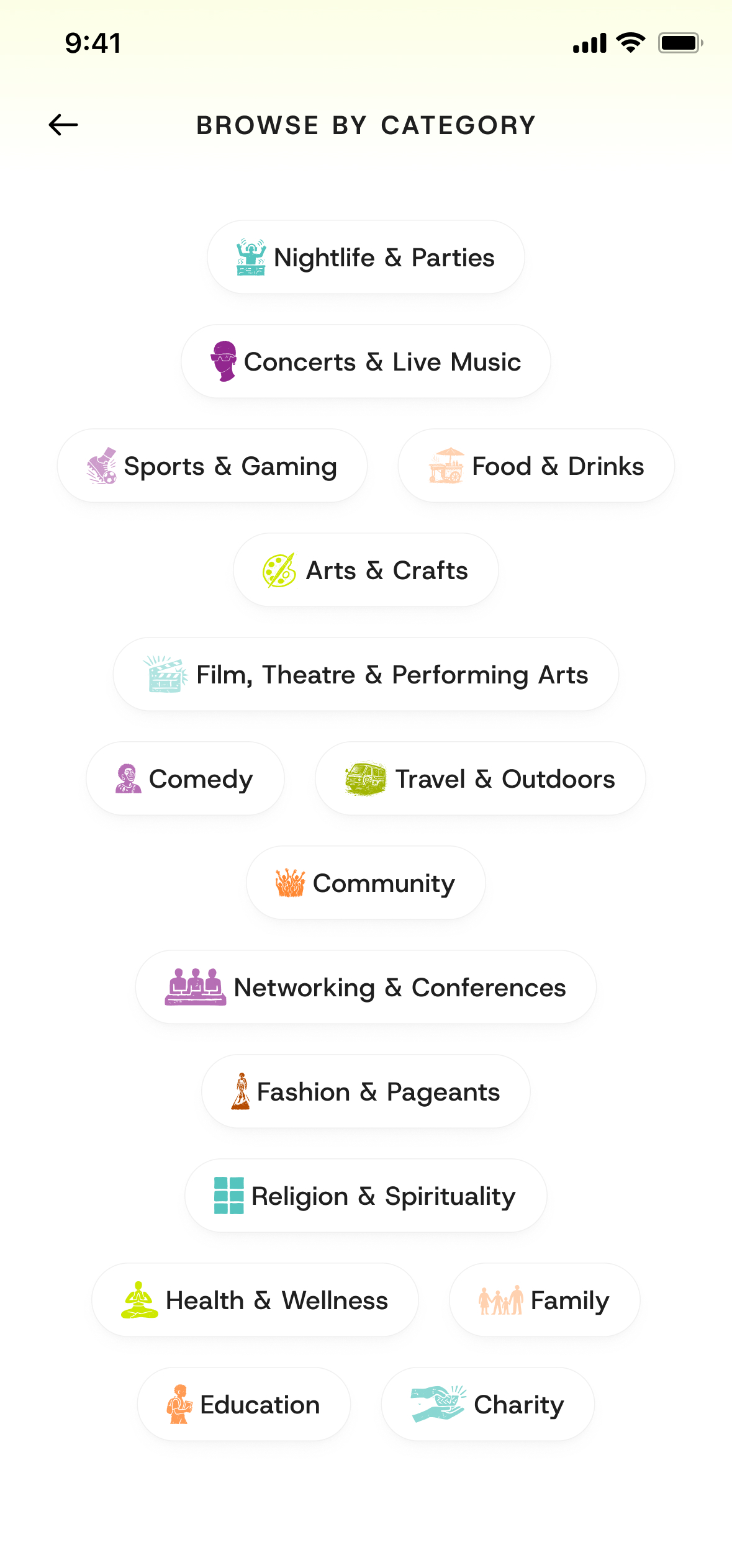
Category taxonomy: 16 consistent categories from Nightlife to Education to Charity.
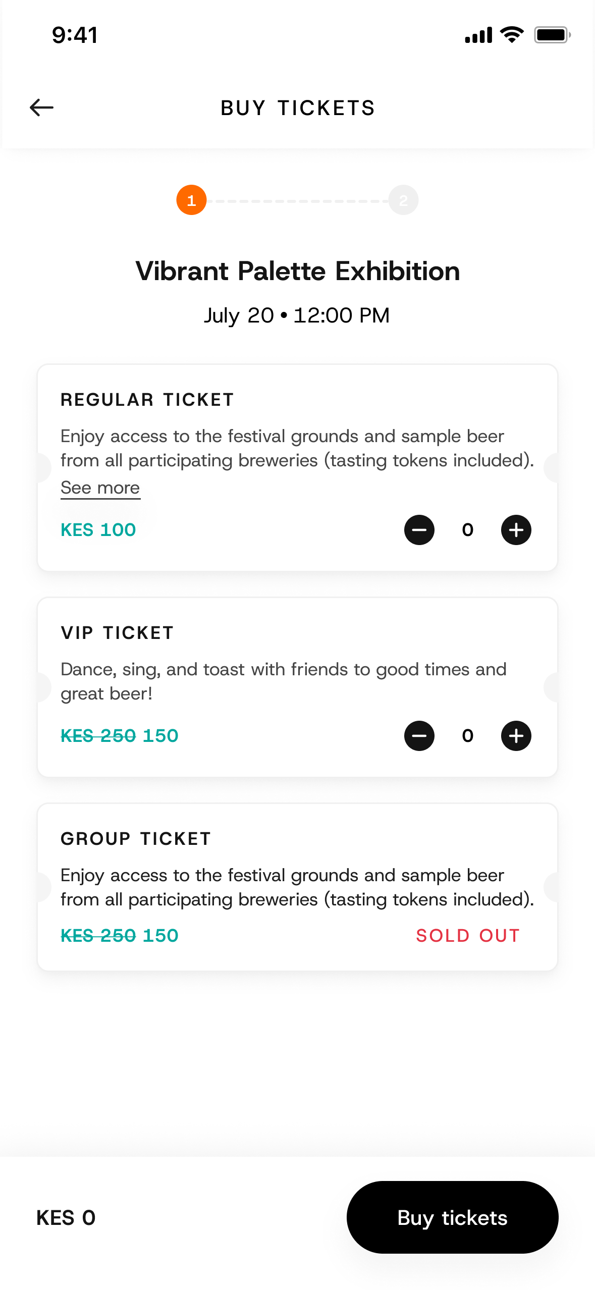
Ticket tier cards: Regular, VIP, and Group tiers with quantity steppers, strikethrough pricing, and sold-out states.
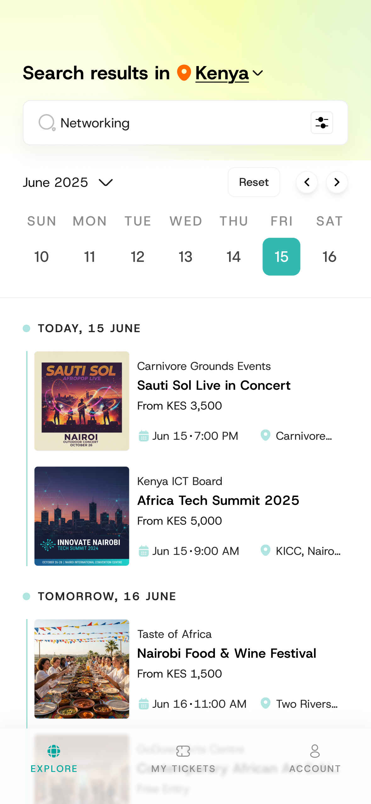
Search + filters: location switcher, recent searches, and a filter toggle for refining by category and date.
Full screens
Search results in Kenya: search field, date selector, and event result cards grouped by day
Search results
Full Browse by Category screen listing all 16 category pills
Browse by category
Full Buy Tickets screen with step indicator, event title, and Regular, VIP and Group ticket tier cards
Buy tickets
Full Search screen with location switcher, search field with filter toggle, and recent searches
Search
Challenges

The tradeoffs behind the decisions.

One task, two starting points Building the purchase flow for both first-time and returning users meant deciding what to ask, when, and what to remember. I chose to front-load data collection only for new users and pre-fill everything for returning ones, accepting the extra design surface in exchange for a faster repeat purchase.
Verification friction vs. trust WhatsApp codes and magic links add a step and a dependency on an external channel. I treated that step as worth it: it removes passwords entirely and uses a channel this audience already lives in.
Breadth of states and markets Supporting multiple countries, currencies, ticket states (available, sold out, used), and payment methods multiplies the number of screens to maintain. The component system and reused list/card patterns were the tradeoff that kept that breadth sustainable.
Working across time zones The engineering team and I weren't always online at the same time. I compensated by over-documenting every design decision: annotated specs with edge-case notes, state matrices for every component, and written rationale for each interaction choice. When an engineer had a question at 2am my time, the answer was already on the canvas.
Impact

What the design work produced.

The app is live, with 6,000+ downloads. Alongside the launch, here's what the design work produced:

Scope shaped the roadmap The expansion from ticket management to full attendee experience was adopted as the product direction. What started as my design recommendation became the company's roadmap for the mobile product.
Complete design spec delivered 60+ screens across 6 flows, covering every state (empty, loading, error, success, edge case). Engineers built directly from these specs with minimal back-and-forth.
Reusable component system The component library I built is shared across iOS and Android, reducing design drift between platforms and cutting implementation time for new screens.
Stakeholder buy-in The prototype and competitive analysis convinced leadership to invest in native mobile rather than continuing to iterate on the responsive web version.

Now that the app is live (6,000+ downloads), I'll keep expanding this section as post-launch usage data comes in.

Looking Back

What designing this product taught me.

The ticket doesn't end at checkout

Designing QR entry, the used state, and ticket sharing was as important as the sale. It's what makes the product feel trustworthy and complete.

Match the pattern to the place

WhatsApp verification and mobile money aren't generic defaults; they're deliberate fits for this audience. Designing for context beats importing a familiar Western pattern.

States are the product

Empty searches, sold-out and used tickets, disabled buttons, and guarded destructive actions are where a design earns trust. These are the screens that separate a concept from a shippable product.

Spend brand energy in moments

Concentrating personality in launch and confirmation lets the working screens stay calm without the product feeling generic.

← All projects Next project →