Designing six products that power live events across Africa.
How I designed six interconnected products as the sole designer at an African event-ticketing startup, from no design system to a live ecosystem that has contributed to 520,000+ tickets across six countries.
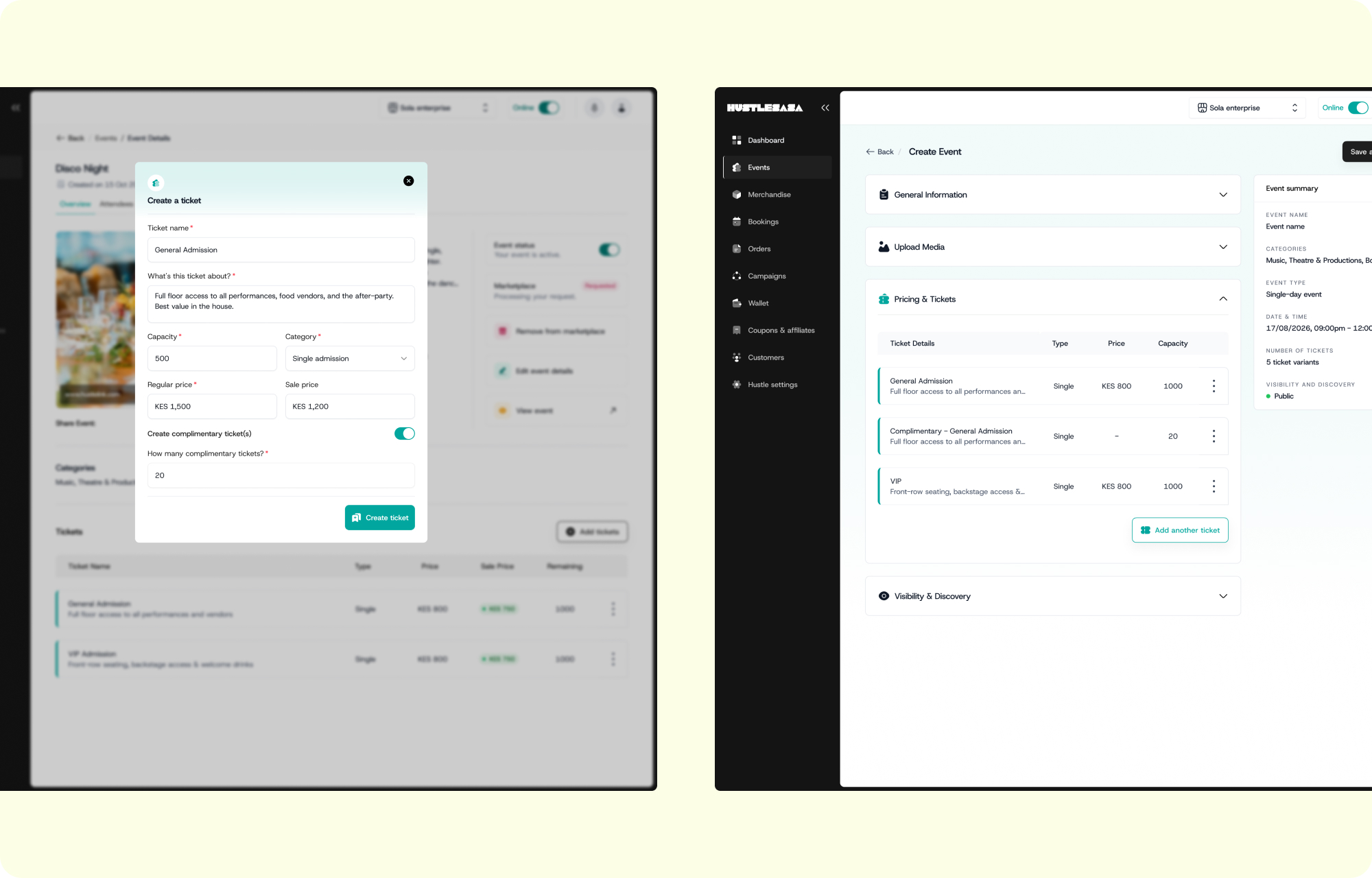
520,000 tickets. Six countries. Every surface was mine.
By the time I visited Nairobi, the platform was live and active:
- 520,000+ tickets processed
- 2,500+ events hosted
- 6 countries — Kenya, Ghana, Tanzania, Rwanda, Uganda, and South Africa
I didn't build the business. But I created the platforms that those transactions moved through; the creation flow, the storefront, the buyer app, the check-in screen at the door.
Experiencing HustleSasa out in the wild
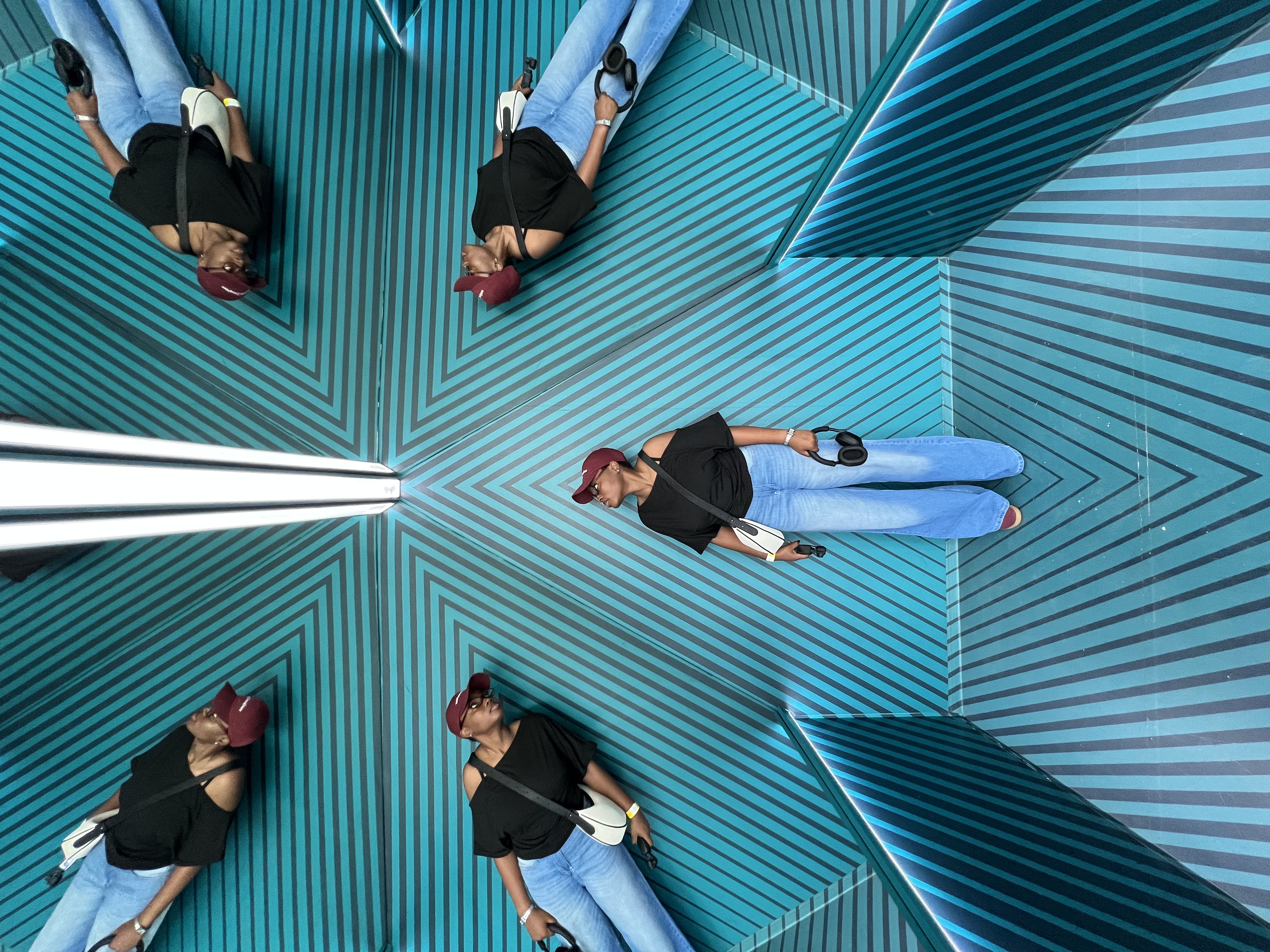
I booked my tickets on a Tuesday night, the same way any attendee would. Selected my session, entered my details, checked out. When I got to the Museum of Illusions in Nairobi a few days later, the staff pulled up the check-in app and scanned my ticket.
I'd designed both of those things.
The booking flow they used to take my order. The scanner screen they held up to my phone. The confirmation email sitting in my inbox. All of it, built over late nights and whiteboard sessions and more than a few wrong turns was now the invisible infrastructure of someone's real experience. Mine included.
That's the thing about building a product ecosystem from scratch. You don't always get to see it work. But when you do, it's hard to describe what that feels like.
There was no design system. No buyer app. No marketplace. Just me.
When I joined HustleSasa in January 2025, here's what I walked into:
- A merchant mobile app designed by a previous designer; the only existing designed surface
- No merchant web app, no buyer app, no marketplace
- Storefronts cobbled together by a front-end developer
- A check-in app winged together for day-of operations
- Inconsistent email templates with no shared voice or tone
- A company mid-rebrand with no finalized visual identity, no design system, no component library
And I was the only UI/UX designer.
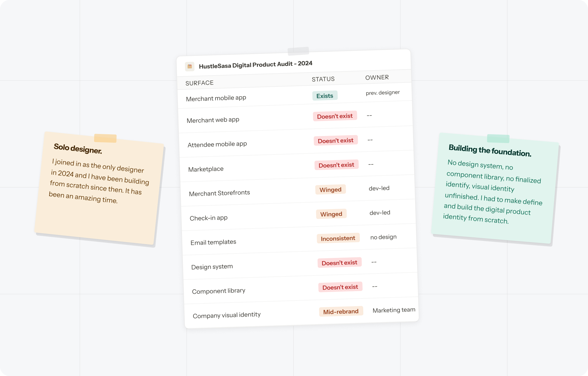
HustleSasa Digital Product Audit — 2025
I didn't start with a blank canvas. I started with a list of user complaints and needs.
- Customer success as a research proxy — The CS team kept a running friction list: a live log of everything users complained about, got confused by, or asked for. That list became one of my most important inputs.
- Product audit — I walked through every existing surface and documented what was broken, what was inconsistent, and what was missing.
- Competitive audit — I reviewed ticketing platforms including Eventbrite, Ticket Tailor, and Webtickets to understand existing conventions.
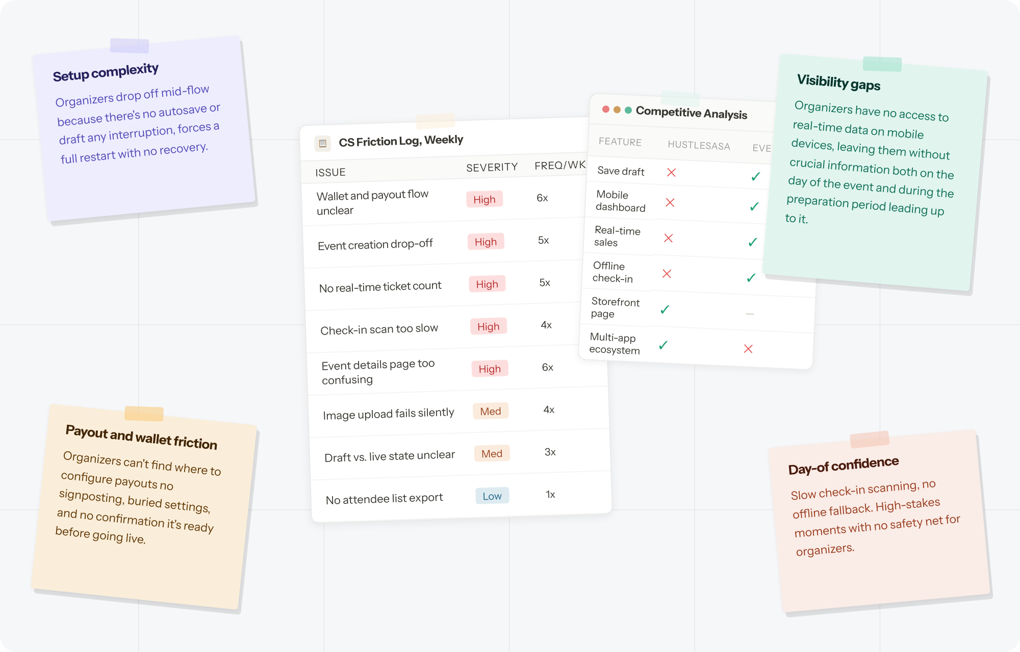
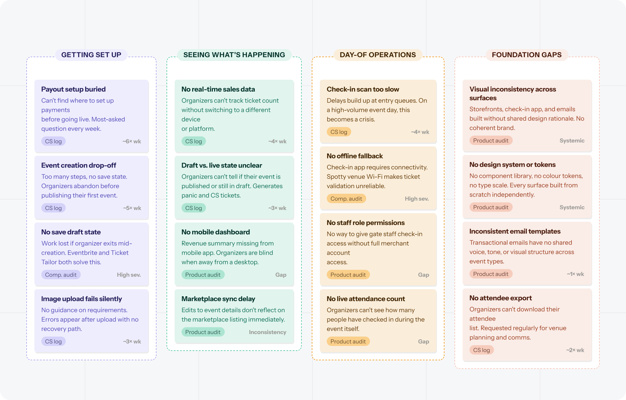
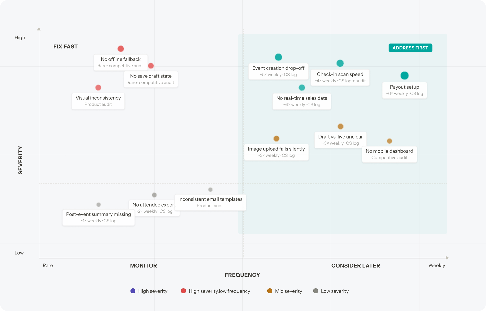
Every decision I made lived in six places at once.
The obvious challenge was volume. But the real challenge was: every design decision I made lived in six places at once.
- HustleSasa isn't one product. An event organizer creates an event on the merchant web app — that event has to appear on the mobile app, populate the marketplace, update their storefront, reflect in the buyer app, and produce a scannable ticket for the check-in app.
- I couldn't design in isolation. Every decision had to be pressure-tested against what it would mean downstream.
- Most of the time, this constraint was invisible. It lived in the thinking before the designs.
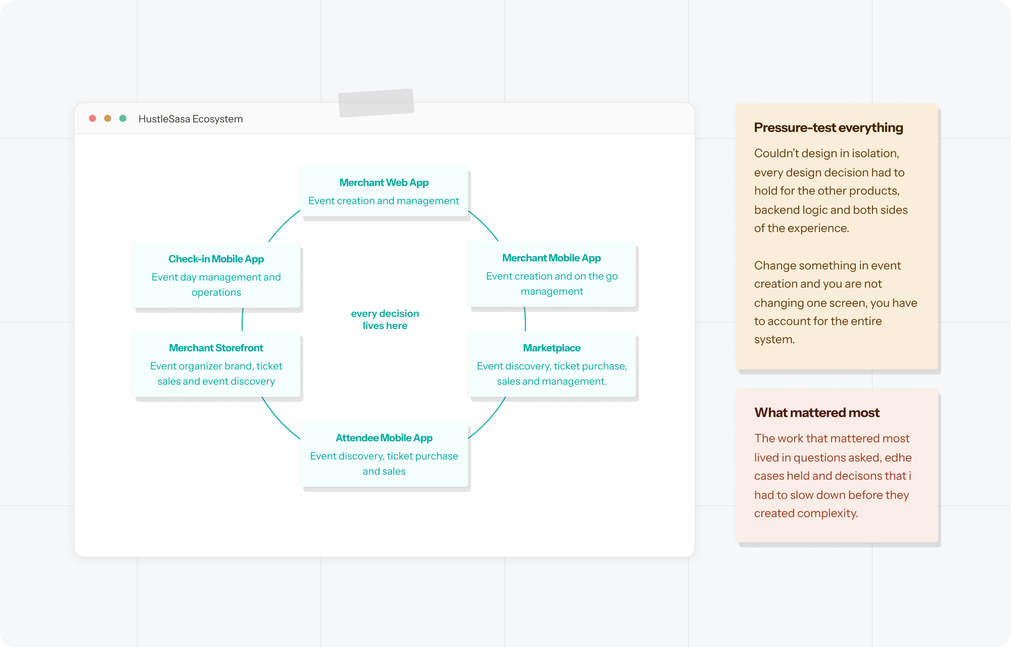
HustleSasa isn't one product. Every design decision I made lived in six places at once.
Before I designed a single screen
With no finalized branding and no existing system, I had to build a foundation stable enough to move fast on, but flexible enough that it wouldn't need to be torn down the moment the rebrand landed:
- Color and typography first: the most load-bearing decisions.
- Navigation patterns next: the skeleton of every surface.
- Universal components after: inputs, buttons, modals, error states.
- Product-specific components last: held off until the flows were clear.
When the rebrand eventually landed, implementing it didn't mean rebuilding. It meant updating. That was the point.
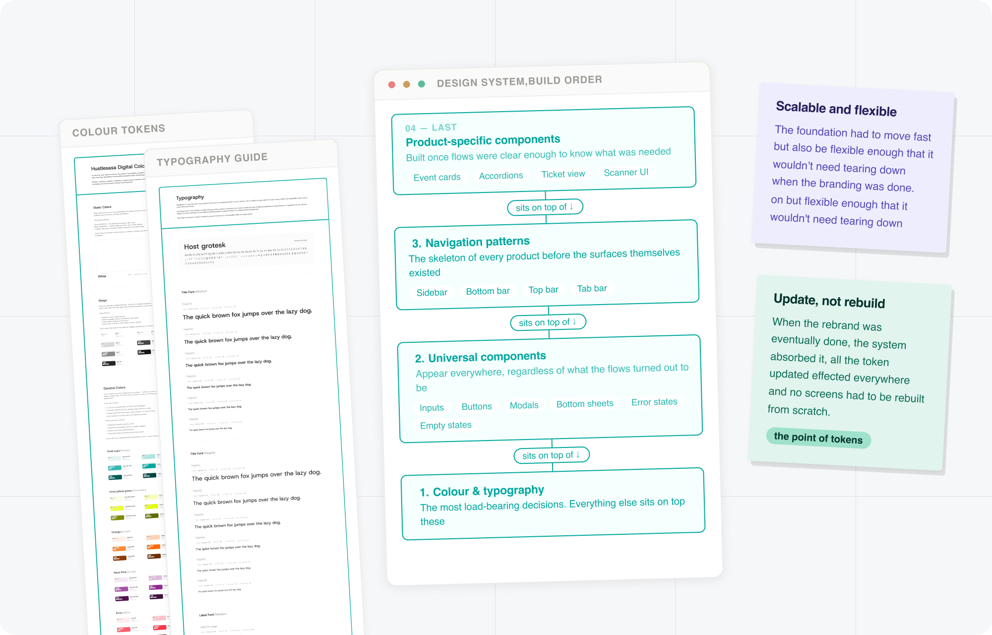
I built a foundation stable enough to move fast on, but flexible enough that it wouldn't need to be torn down the moment the rebrand landed
The problem that wasn't what it looked like
Some of the problems looked simple right up until they weren't. Designing the complimentary tickets flow was one of those.
My first instinct was a gifting flow. Except I'd misunderstood the problem. A special guest shouldn't have to go find a zero-naira ticket on a storefront and check themselves out. They should just have the ticket. It should arrive in their inbox, no friction, no awkwardness — because that's what it means to be a special guest. So I went back.
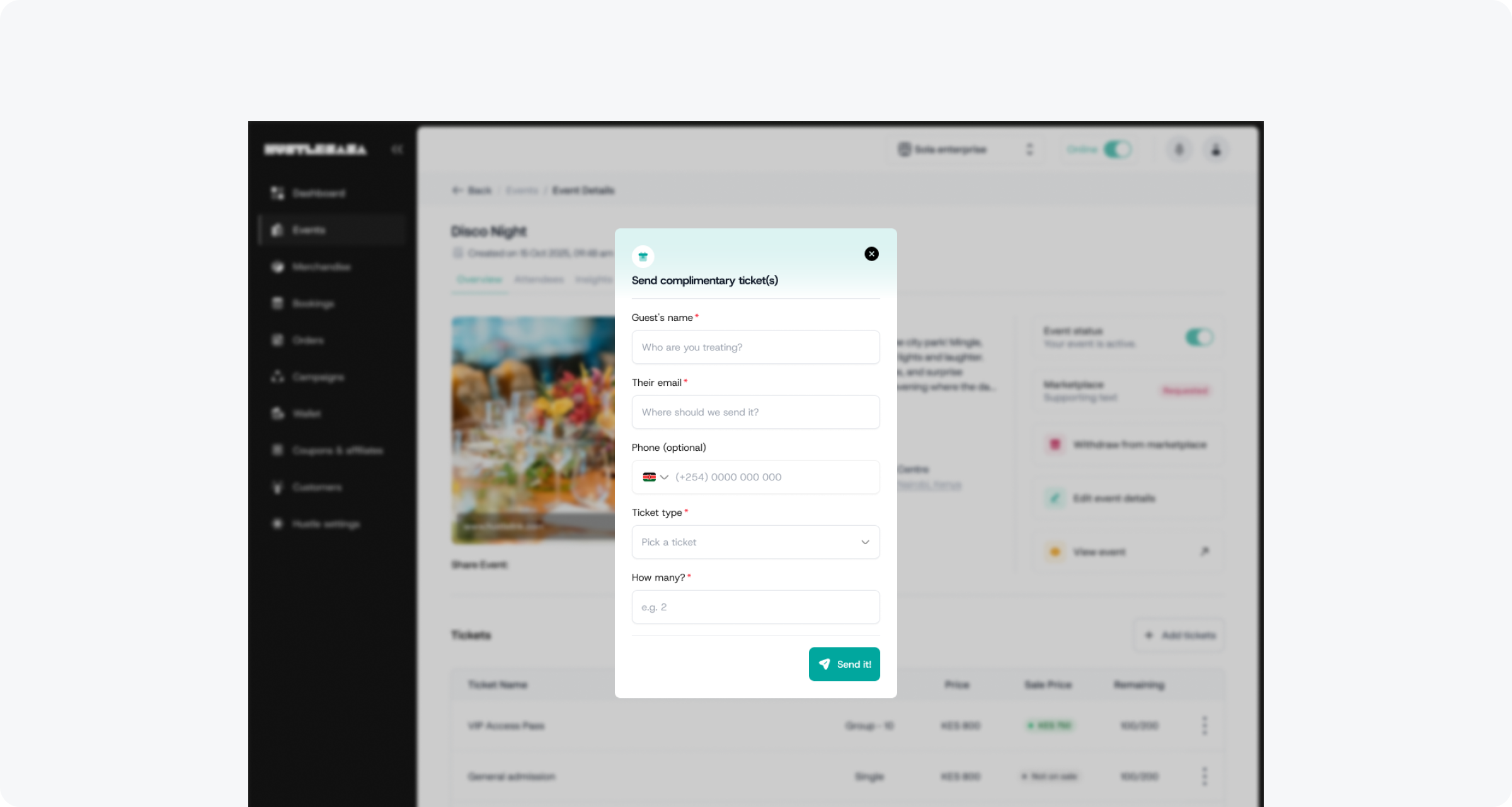
First iteration — a simple gifting flow triggered from the event dashboard
My second instinct was to let organizers create a separate free ticket type for each tier they wanted to comp; free VIP, free VVIP, and so on. That fell apart quickly too. You'd be asking organizers to double their ticket setup work every time they wanted to offer complimentary access. That's not a solution, that's taxing the user.
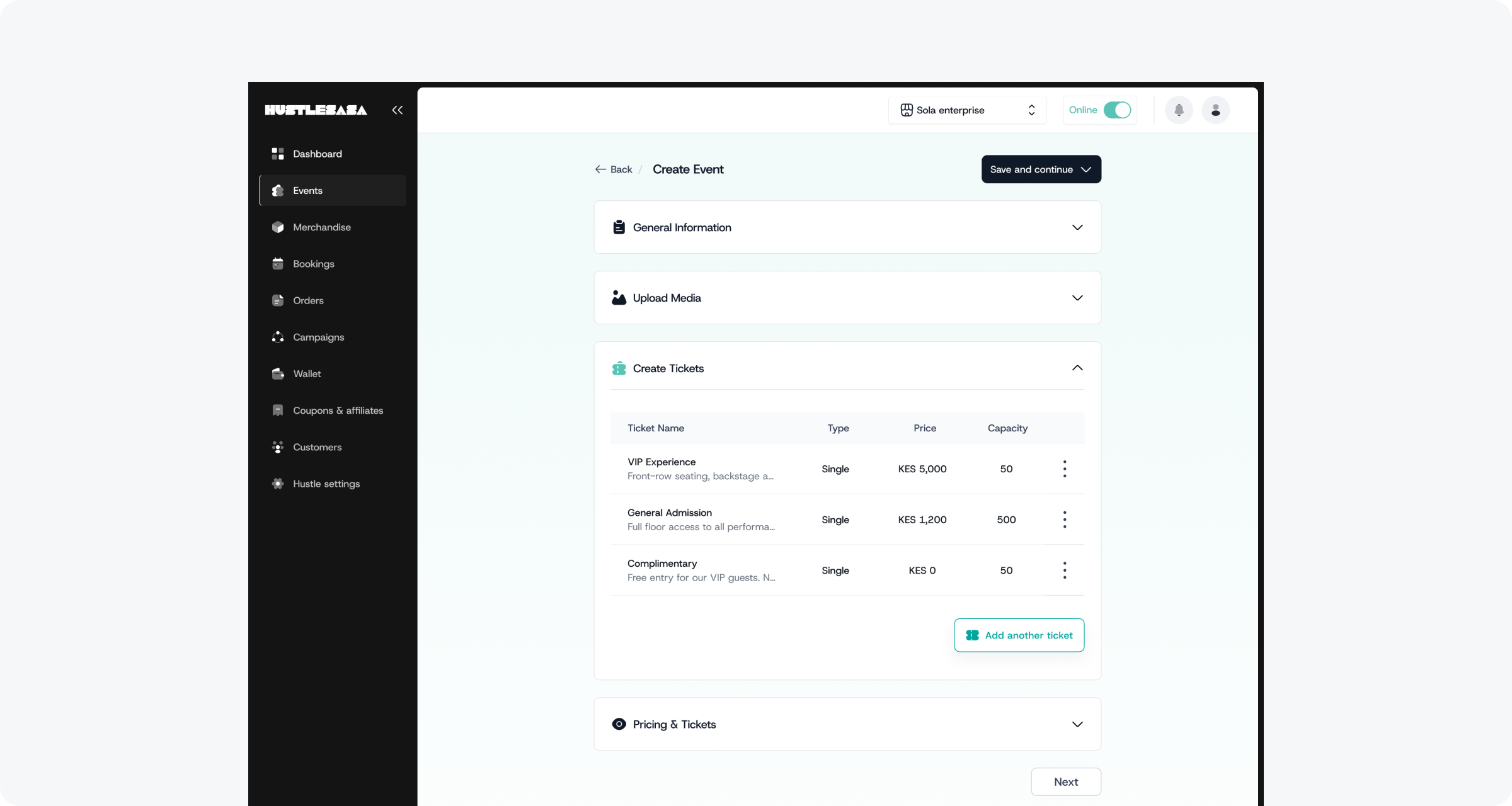
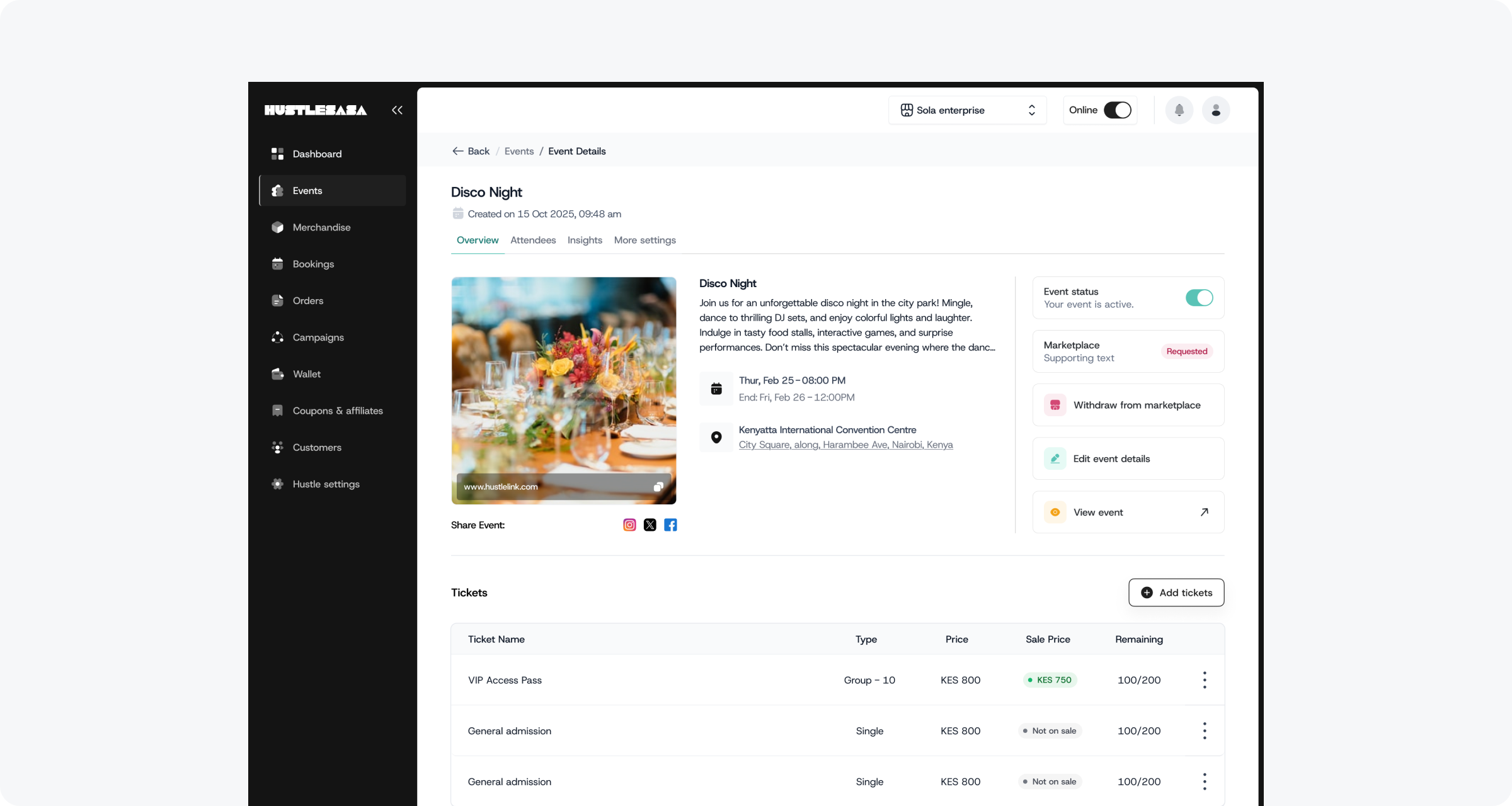
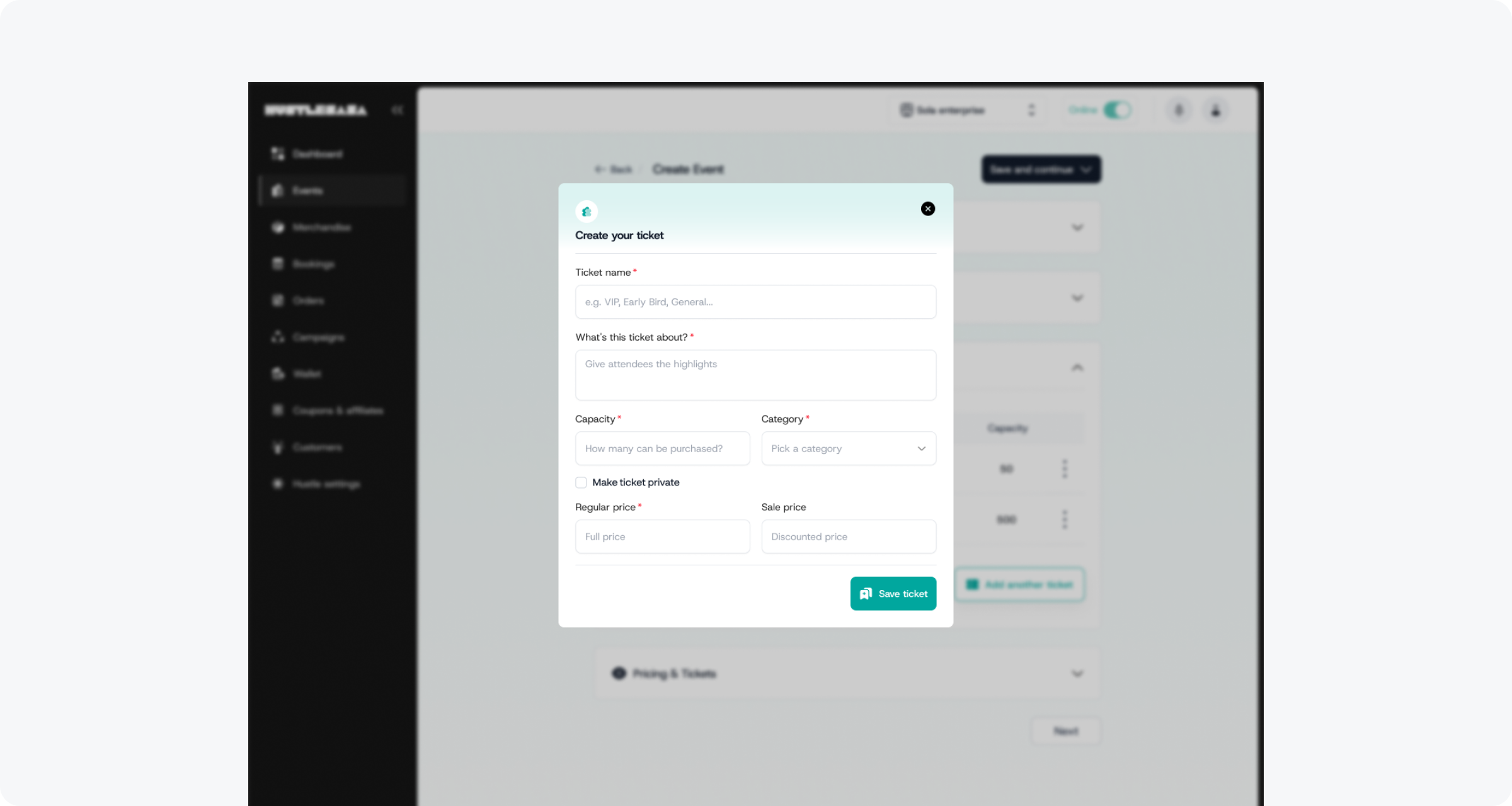
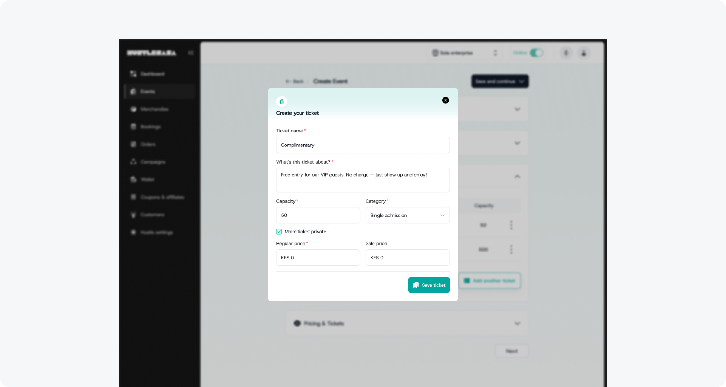
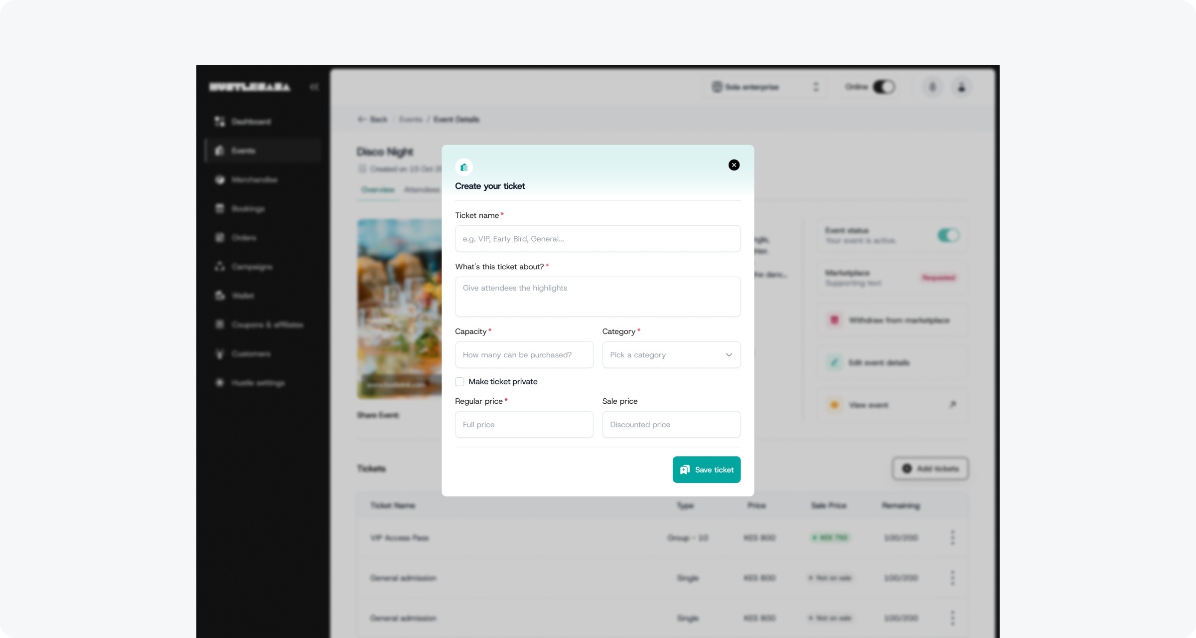
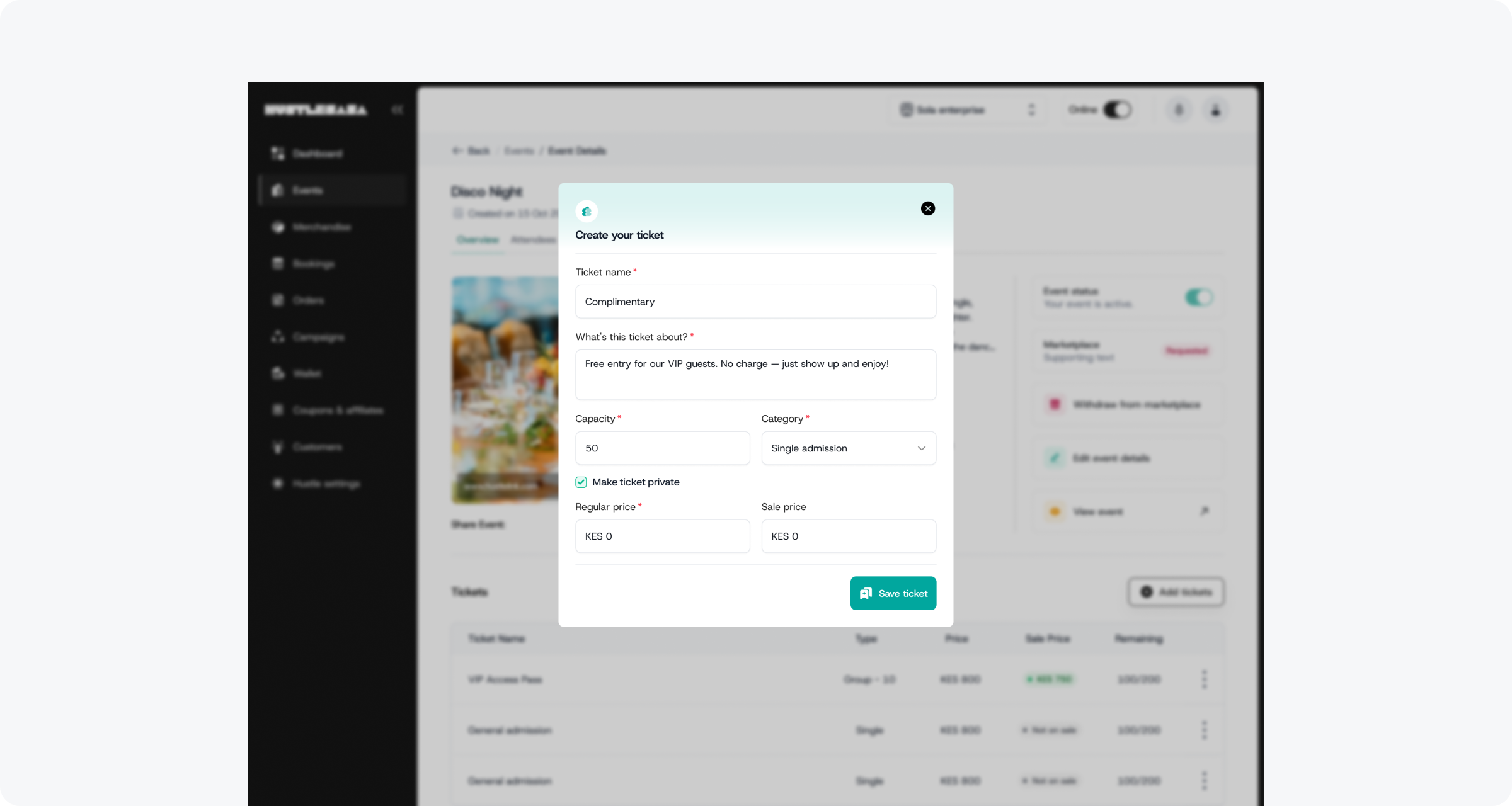
One reusable modal — two entry points, zero duplicated work
The answer I landed on was simpler and more considered: a single toggle during ticket creation or on any existing ticket that duplicates it as a complimentary version. Automatically hidden from the storefront, the marketplace, the buyer app, invisible to the public, but fully functional on the backend. No new ticket type to create. No separate flow to manage. Just a quiet extension of something that already existed.
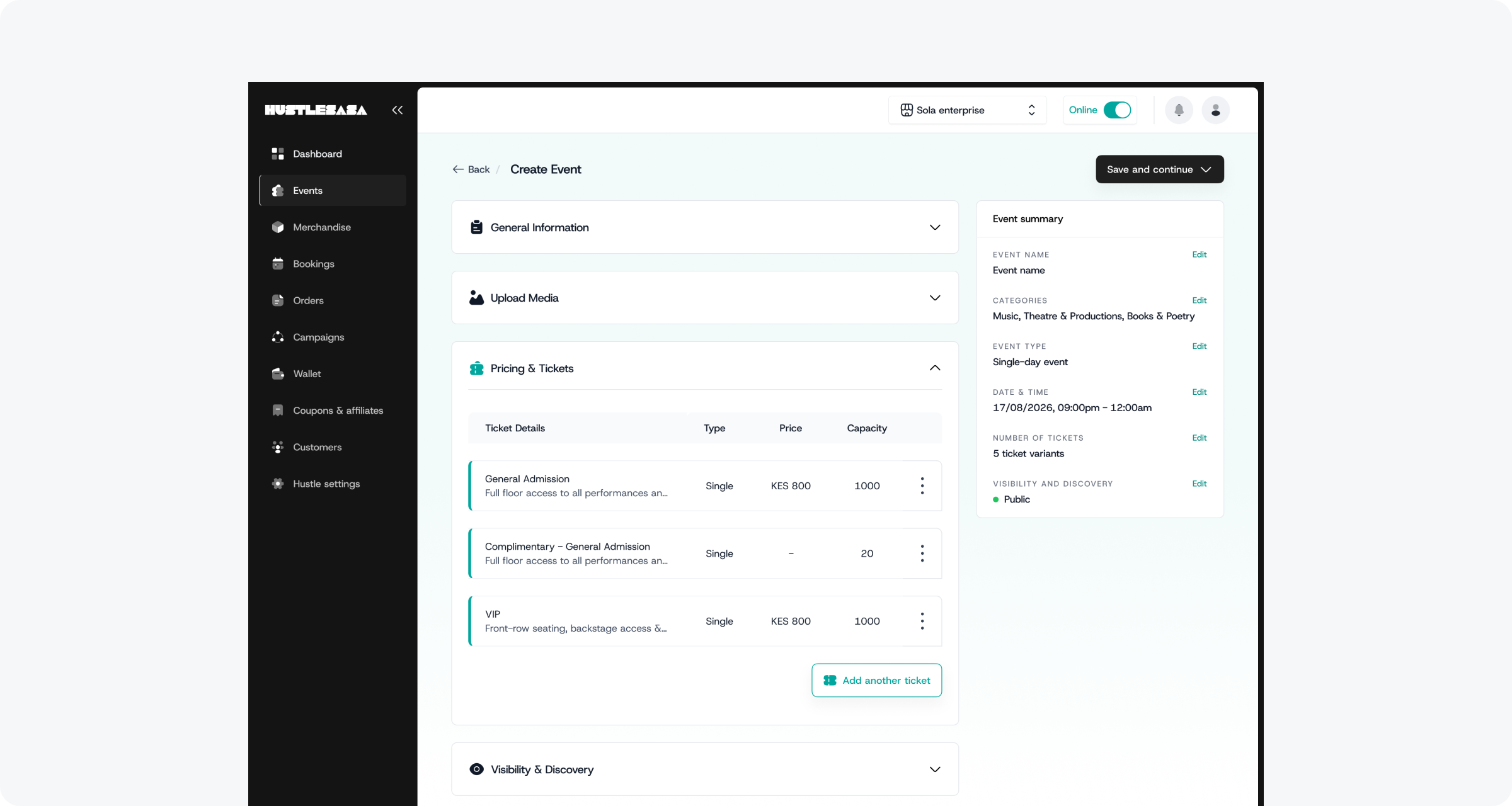
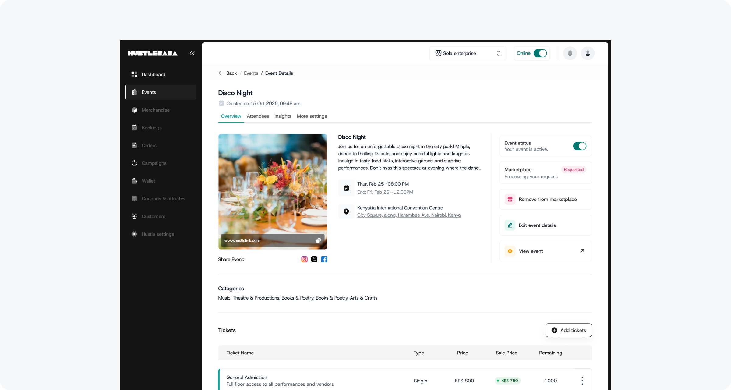
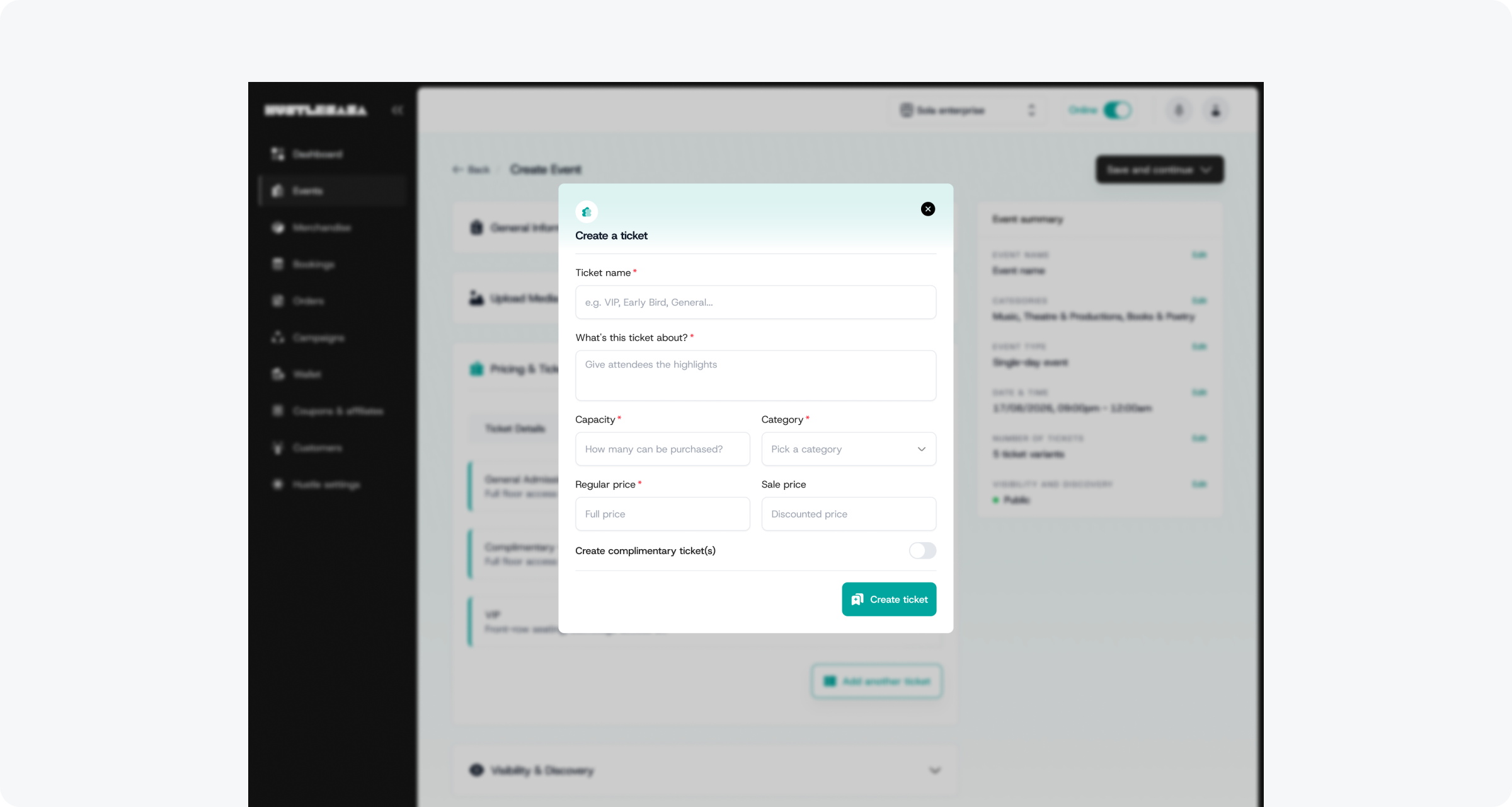
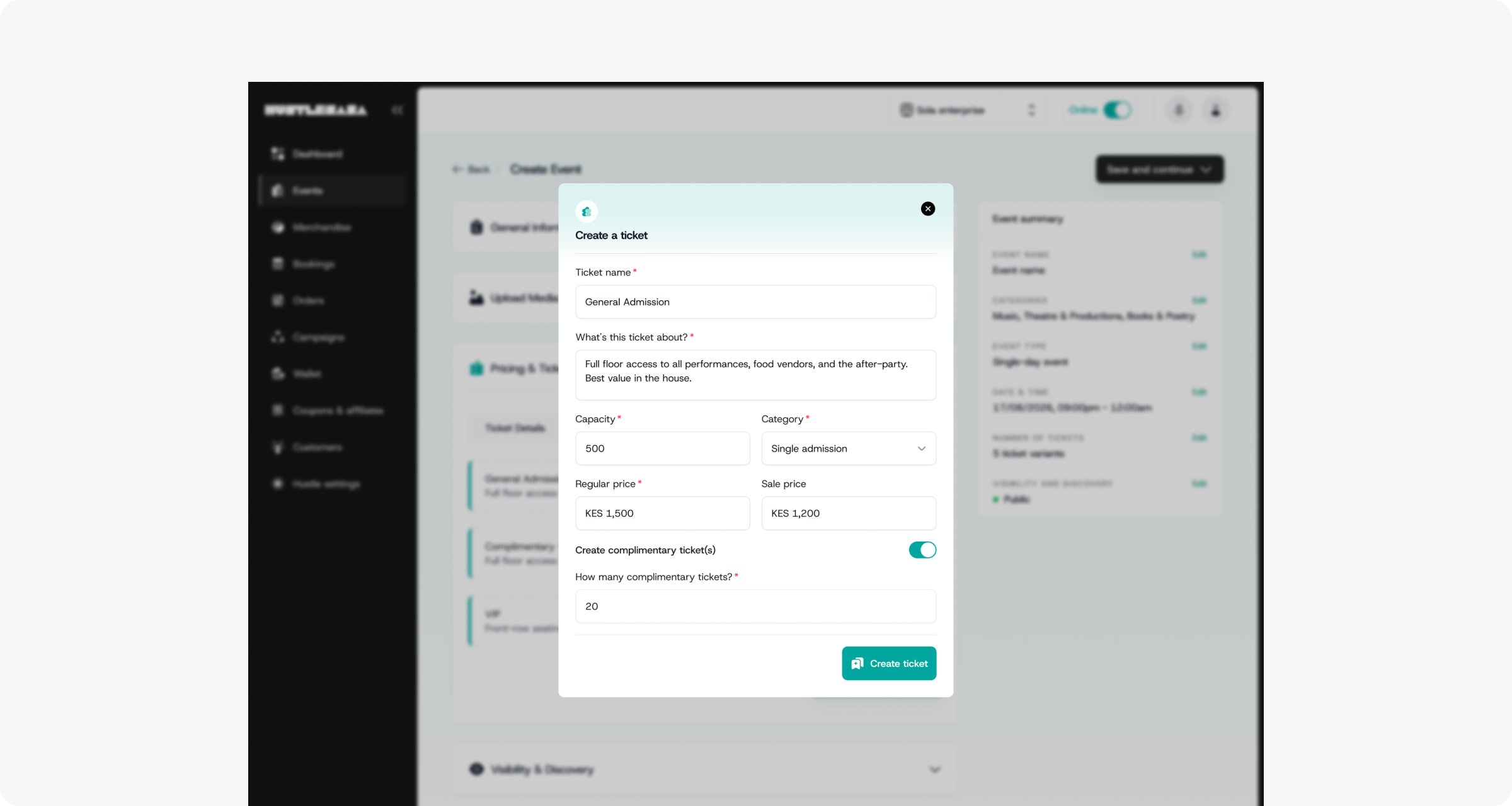
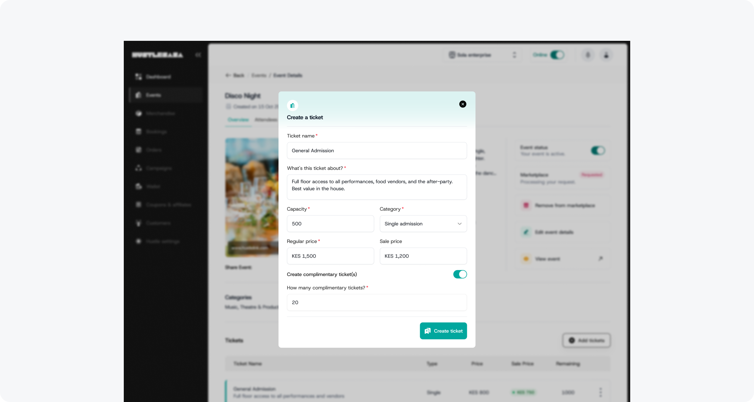
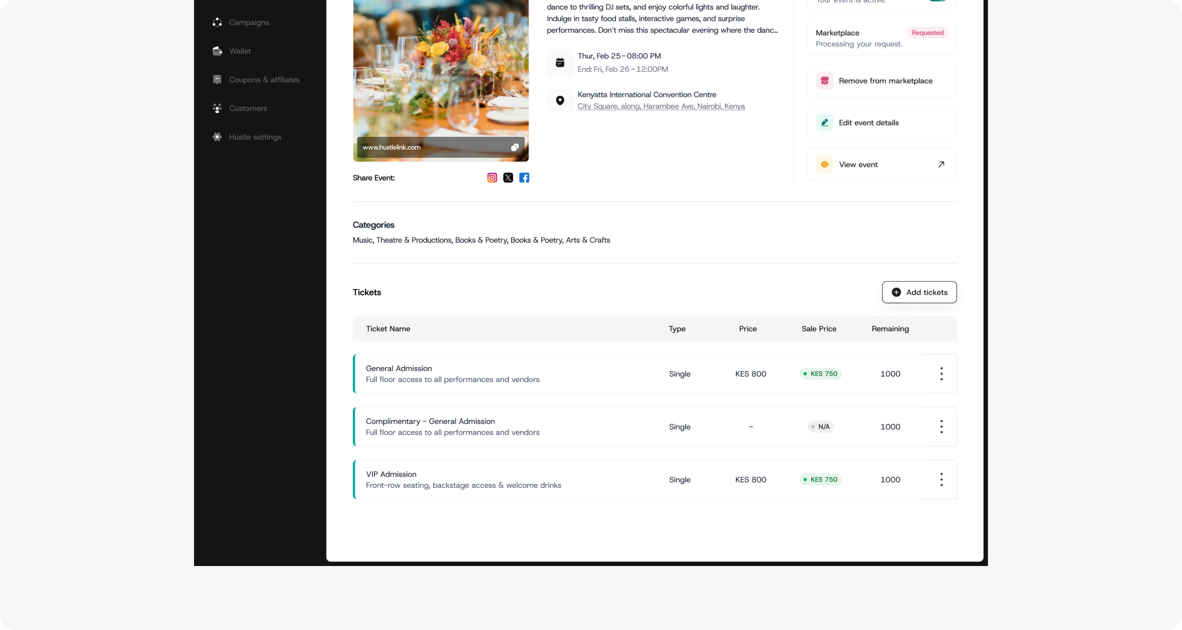
One toggle, no new flow: complimentary tickets live inside the existing ticket creation modal
Then came the distribution problem. Bulk sending via CSV upload sounds simple until you account for the fact that CSV files are messy in the real world.
My solution: design for partial success. If 180 out of 200 records are valid, send to 180. Show the organizer exactly which rows failed and why. For example: Row 23, invalid email format. Row 47, missing first name — and give them the choice to proceed or fix and re-upload.
What I thought was a simple gifting flow ended up being a multi-layered distribution system with its own edge cases, error states, and UX decisions at every turn. The final solution wasn't clever. It was just right — because I'd taken enough wrong turns to understand what the problem actually was.
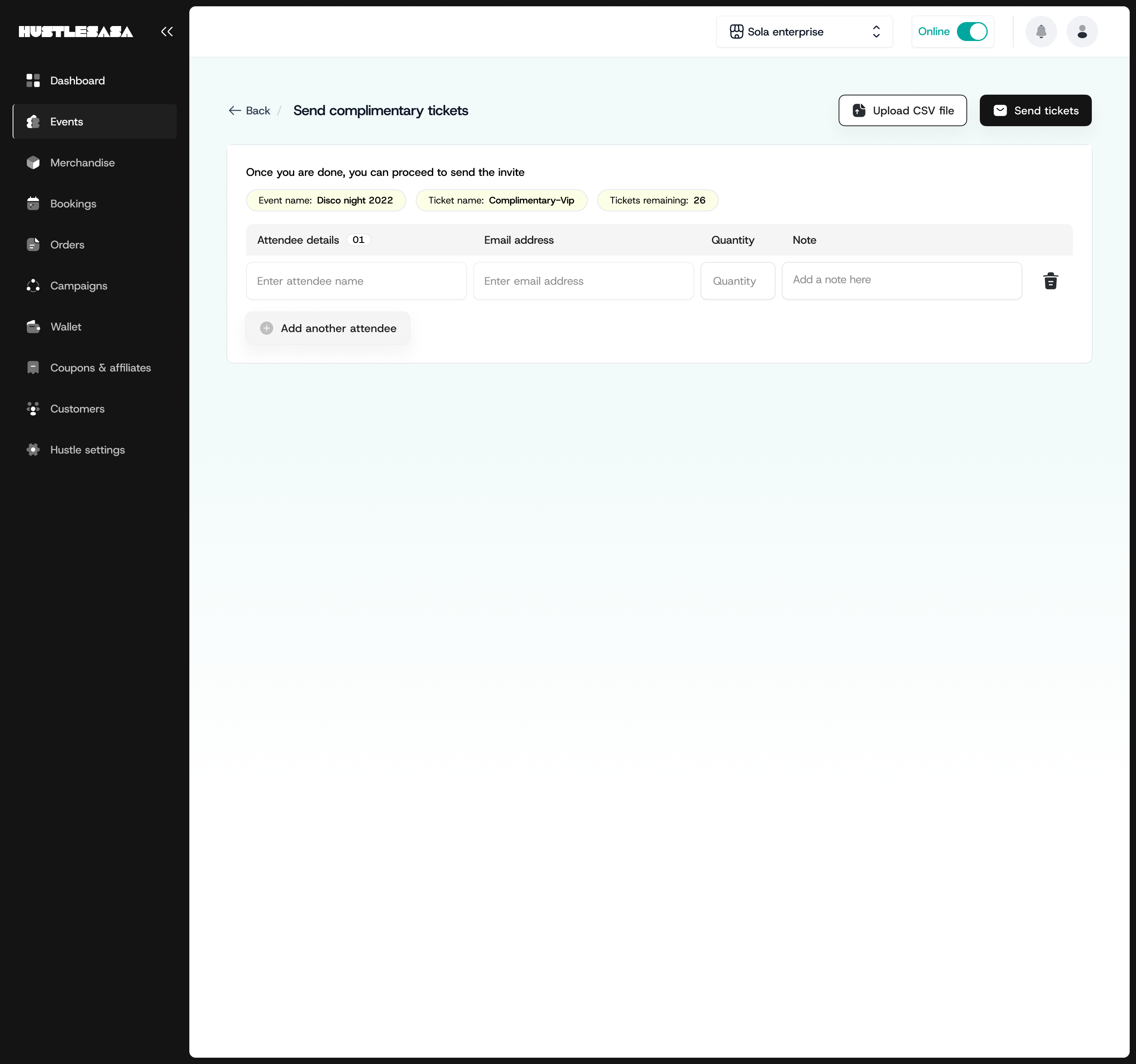
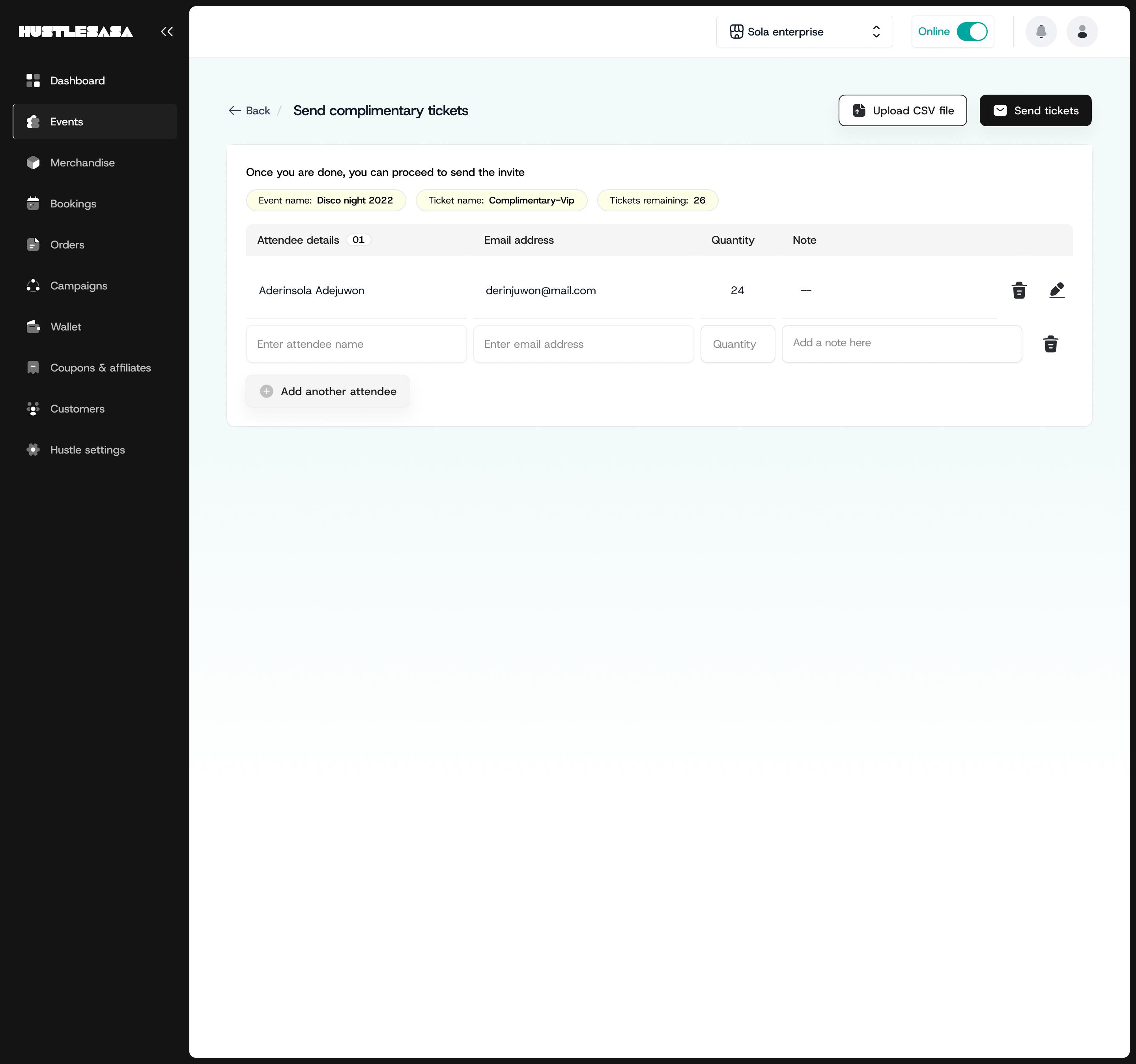
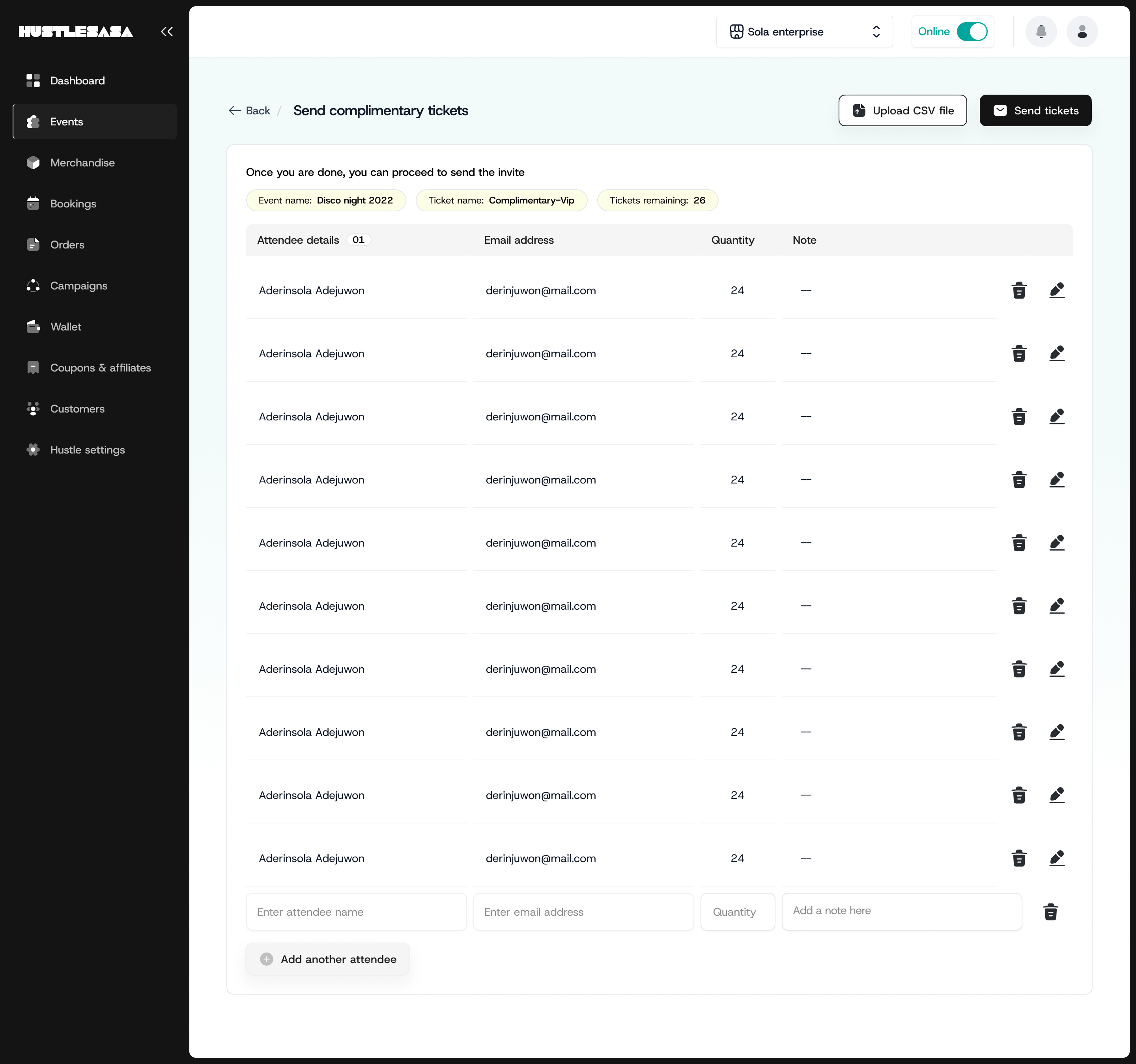
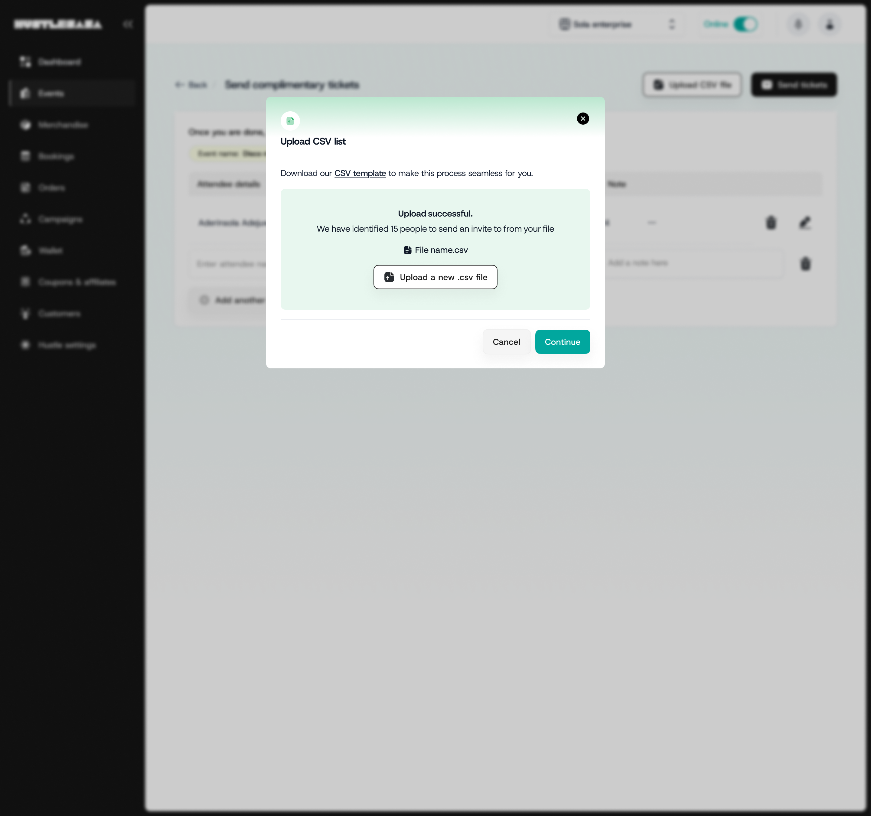
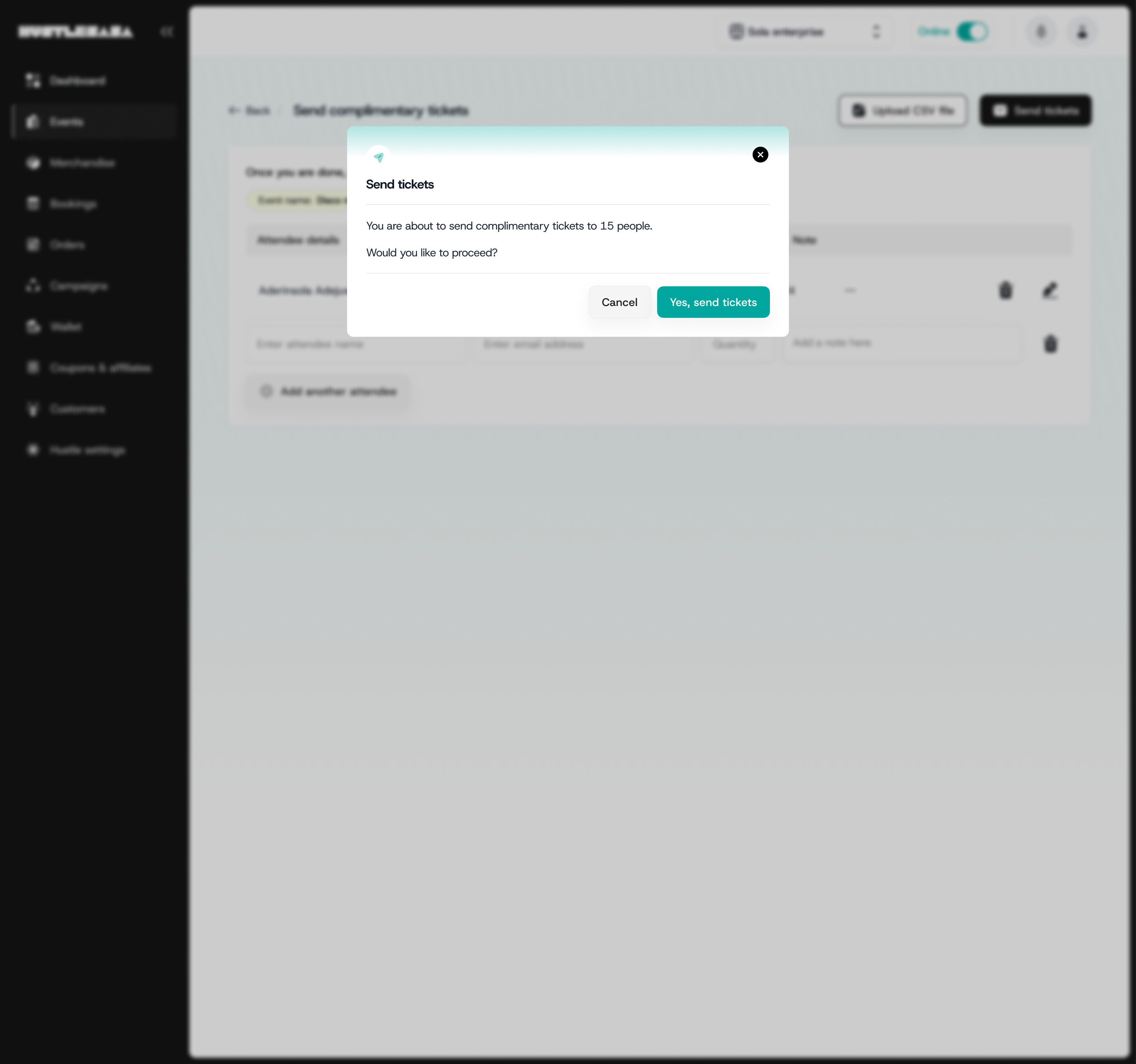
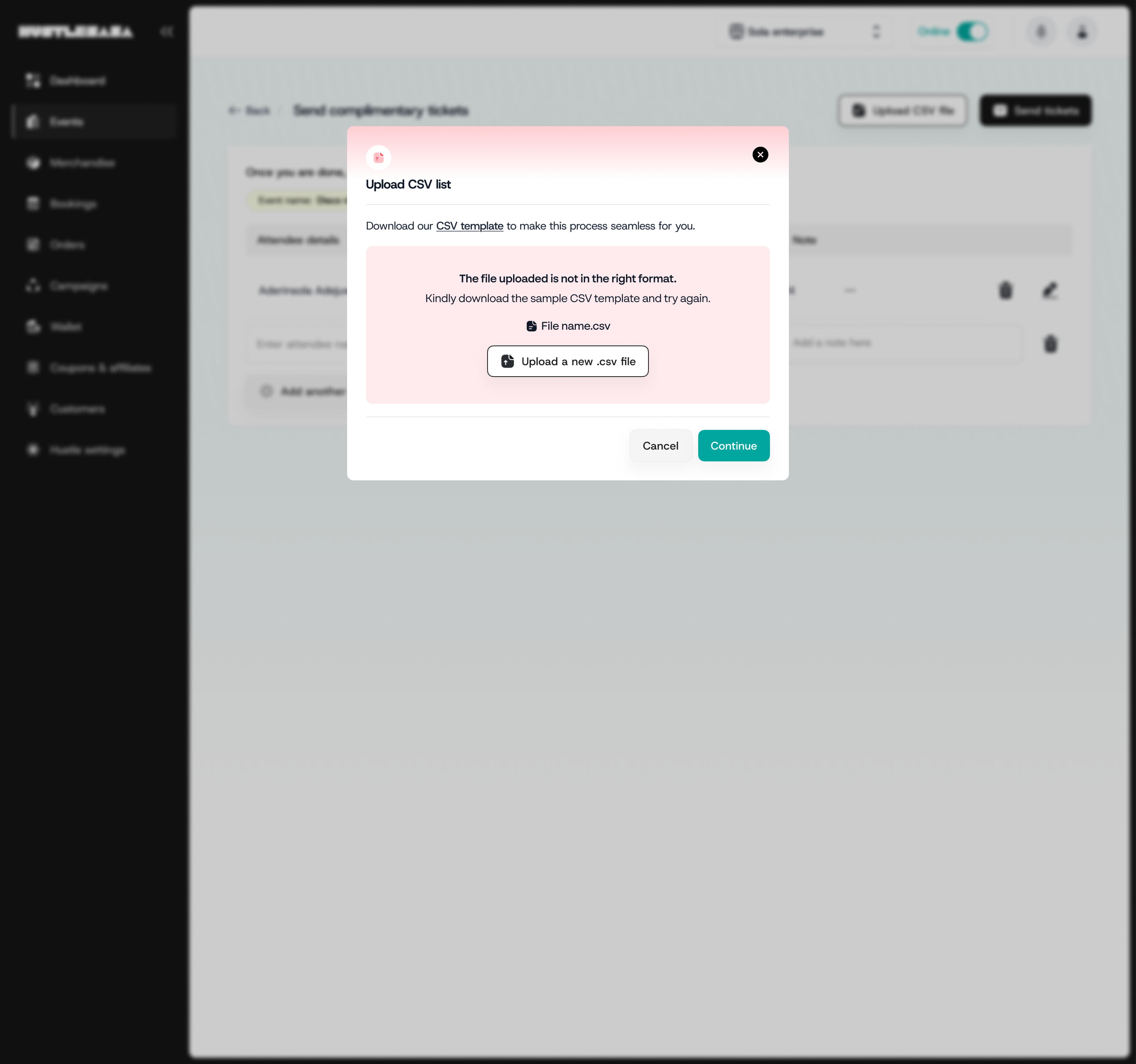
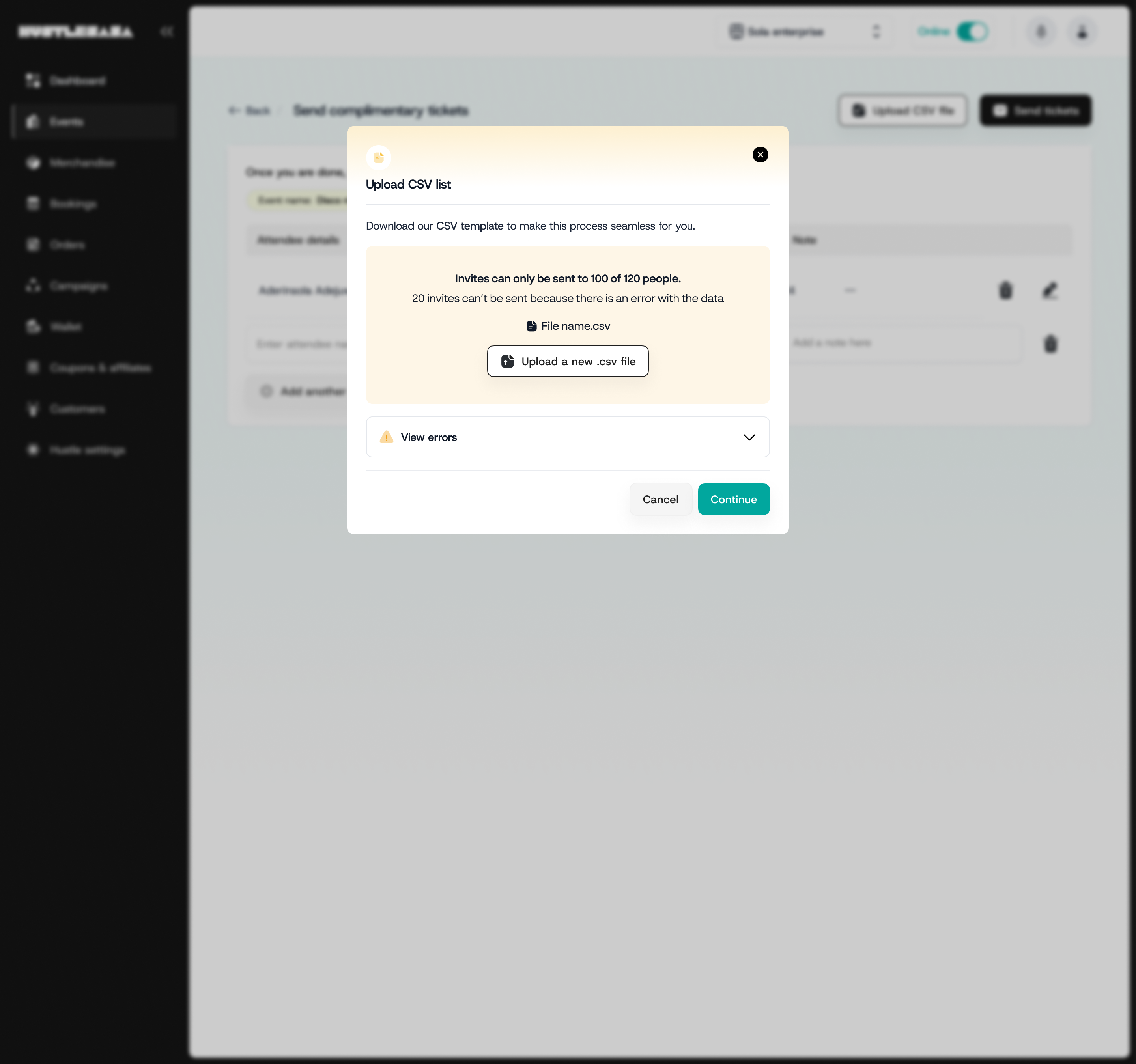
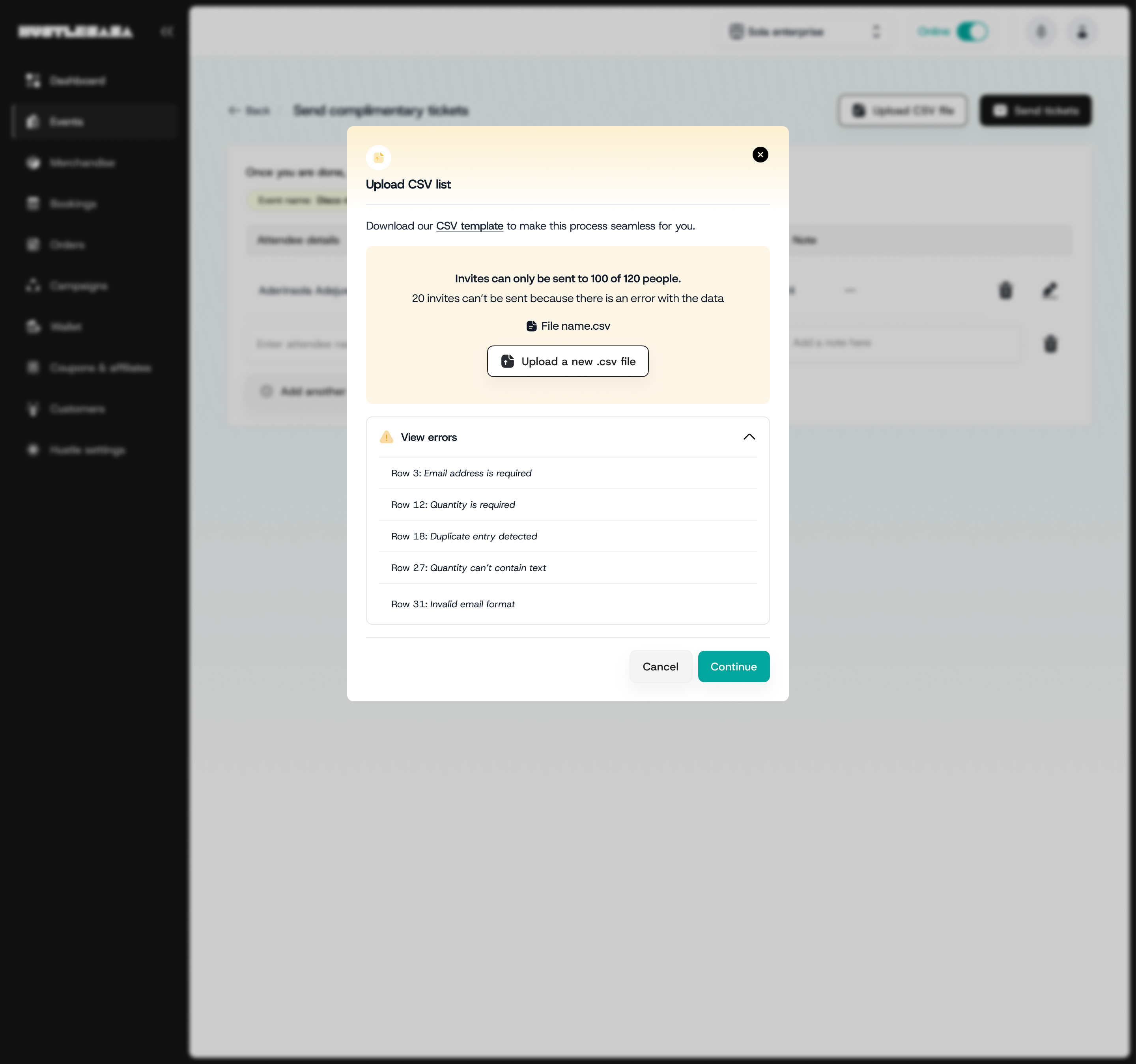
Two input paths, three upload outcomes: every state designed and annotated
What it actually meant to push back
Thinking across the ecosystem also meant pushing back when a decision optimised for the wrong thing.
- One example: to drive buyer app downloads, the initial proposal was to send web users to the App Store directly. In practice: user clicks download on laptop → desktop app store → told mobile only → pick up phone → search manually → download. Every step was an opportunity to lose them.
- I pushed for a QR code: One scan, we detect the OS, route to the right store. Five steps became one.
That's what holding the ecosystem meant in practice. Not just making sure designs were consistent across surfaces, but making sure the decisions connecting those surfaces actually served the person moving through them.
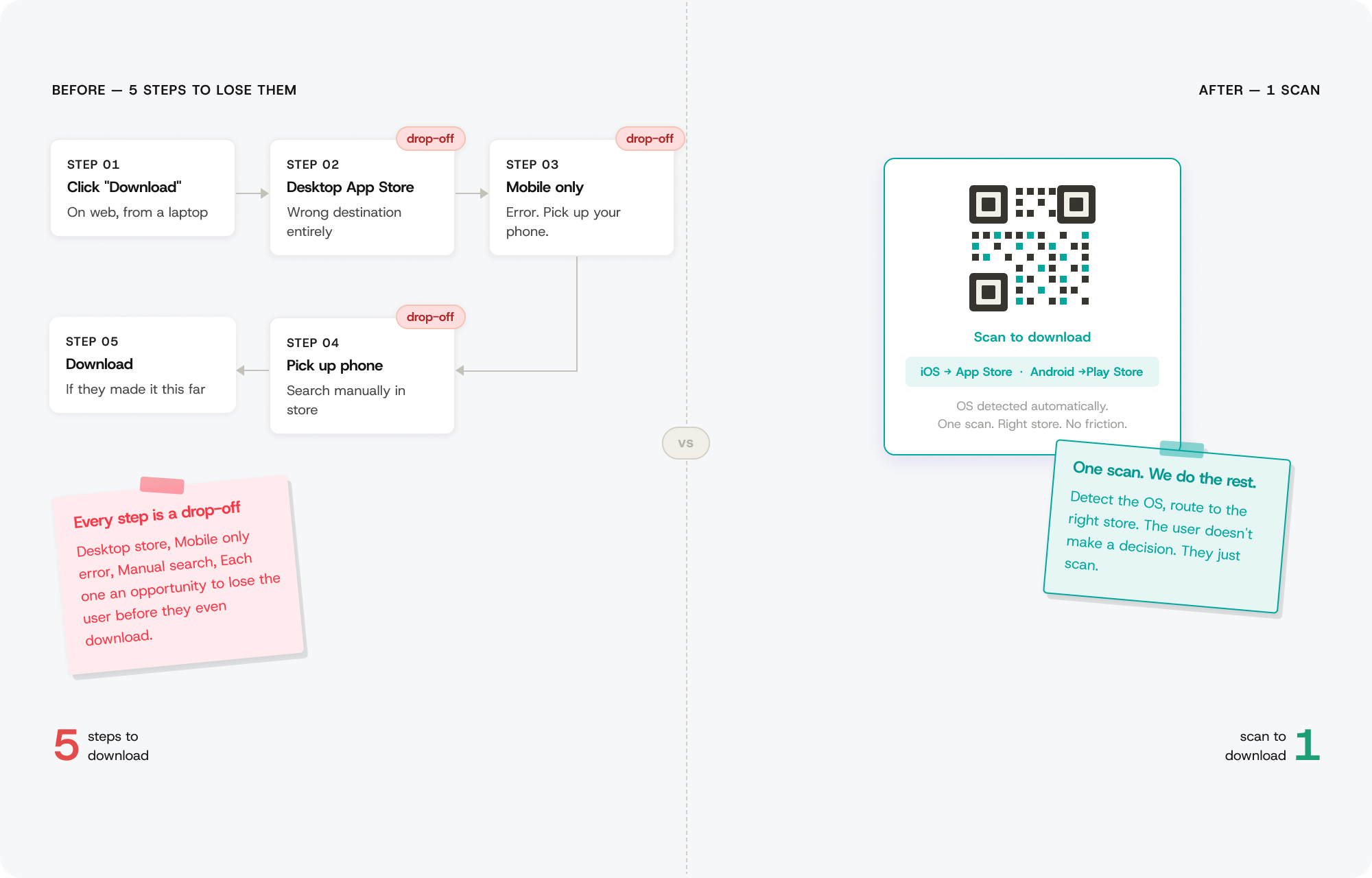
What it felt like when it worked
I didn't go to the Museum of Illusions expecting to have a moment. But standing at the entrance, watching the staff member hold up the check-in app to scan my ticket — my ticket, on a platform I'd spent the better part of a year building — something landed that's hard to put into words.
Not pride exactly. More like proof.
Proof that the late nights spent untangling edge cases had added up to something real. That the wrong turns — the gifting flow that missed the point, the free ticket type that taxed the wrong person — had all been part of getting to something that actually worked.
Most of the time, design is invisible. It works best when people don't notice it. You don't get to see the moment it clicks for someone else. That day in Nairobi, I got to see it click for me.
And that was enough.
What I learned from building an ecosystem alone.
Building the system before the surfaces. That upfront investment (the tokens, the patterns, the navigation scaffolding) is what let me move fast later without creating inconsistency. And the hardest part of design isn't the screens, it's the decisions between them. The connections, the dependencies, the downstream consequences of what looks like a simple choice on one surface.
Wrong turns aren't wasted time. Every failed iteration on the complimentary tickets flow, every pushback conversation, every edge case I discovered at 11pm: those were the moments the product got better. The polished UI is what people see. The thinking is what made it work.
Document decisions earlier. I was moving so fast that I didn't always record why I made certain choices. A lightweight decision log would have saved time. Push harder for user testing. Most of my research was indirect. Direct observation would have caught things the logs couldn't. Build the component library in code sooner. The design system lived in Figma before it was reflected in code. That gap created drift.