I built the productivity app I couldn't find.
How I designed and built a real-time competitive productivity app from a personal frustration into a live product with 130 users in its first week, no marketing budget.
Nobody is watching.
Most productivity apps assume people fail because they lack the right system: the right to-do list, the right timer, the right streak mechanic. But that's not really why people abandon their tasks. The real reason is that nobody is watching.
I'd noticed this in myself for years: I'm dramatically more productive sitting across from someone at a café, or on a call where we're both working, or even just knowing a friend will ask me later how the day went. The presence of another person creates something that no app had managed to replicate.
Outdo is my answer to that. A real-time competitive productivity app where you create a room, share a code with someone, add your tasks, and work while watching each other's progress on a live leaderboard.
"People complete tasks more consistently when others can see their progress in real time."
The goal was to create the digital equivalent of sitting across from someone at a library. You don't need to talk. You just need to know they're there and they can see what you're doing.
This isn't a new idea — it's the oldest one in behavior change. Focusmate sells silent co-working calls; gyms sell classes over equipment; study halls exist for a reason. What none of them had built was a low-effort, always-on version that works asynchronously, without booking a slot or turning on a camera. That gap is the whole product.
Three personas shaped every product decision.
Before building, I mapped what already existed: Focusmate, Forest, social habit trackers, multiplayer focus tools. The pattern: the social layer, where it existed at all, was either asynchronous (share your streak after the fact) or passive (see that a friend also uses this app). None put two people in a live session where both could see each other's output in real time.
| Product | Social Layer | Live Session | Real-Time Compete | What's Missing |
|---|---|---|---|---|
| Focusmate | ✓ Video co-work | ✓ | ✗ | Accountability without competition. You're together but scores don't exist. |
| Forest | ~ Friends mode | ✗ | ✗ | Social is async and passive — you see a friend's tree after the fact. |
| BeReal-style apps | ✓ Async sharing | ✗ | ✗ | Visibility without structure. No task layer, no competitive mechanic. |
| Notion / Things | ✗ | ✗ | ✗ | Pure personal productivity. Social layer doesn't exist. |
| Discord study rooms | ✓ Passive presence | ✓ | ✗ | A community workaround — presence without product. |
| Outdo | ✓ Live rooms | ✓ | ✓ Weighted board | The Gap Filled Live session + task layer + real-time competition in one product. No other tool does all three. |
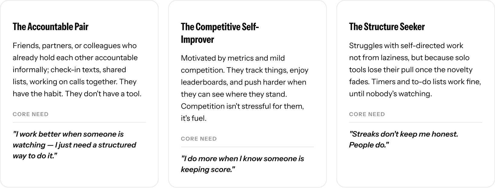
These three personas shaped almost every decision: why the room is the unit (not the individual), why the leaderboard is always visible (not a tab), why joining friction had to be as close to zero as possible.
The mechanic is the product, not a feature of the product.
A lot of productivity apps layer social elements onto what is fundamentally a personal tool, and it never quite works because the social layer is always optional. Remove the other person from Outdo and there's no product. The room is the unit, not the individual. That's a constraint I imposed deliberately, because it forces every feature decision to serve the social dynamic rather than compete with it.
The product went through four names: Streakmates (felt like a habit tracker), Taskrace (functional but cold), Pace (too passive).
Outdo said it in one word. It's a verb. It implies another person without naming them. It captures both the competitive dynamic and the personal improvement angle simultaneously.
What I shipped, and why each piece exists.
The core product: shared rooms you join via a code or link, a live leaderboard that updates in real time, AI-assisted task input that parses natural language, and a midnight reset in local timezone so each day starts clean. Plain HTML, CSS, and JavaScript on the frontend. Firebase Realtime Database for live sync. Cloud Functions for server-side logic including the Claude Haiku integration.
No account, no email, create or join a room in about 30 seconds.
{{ a.body }}
Describe your day in plain language; don’t fill out a form.
{{ a.body }}
Score by weighted percentage, and never hide the leaderboard.
{{ a.body }}
Put your tasks and the competition on one screen, moving in real time.
{{ a.body }}
The hard parts weren't what I expected.
Real-time sync itself worked cleanly once I understood Firebase's data structure. What was actually difficult was the stuff that sounds simple in a feature list.
What users told me after the first week.
"This app came at the very moment where I needed structure for myself and my partner. I really love Outdo and I waited two weeks to give comprehensive feedback... Outdo has so much more potential. Can the tasks not disappear after 24 hours? I cannot track my progress over the 2-week room, to see what day I was able to complete what."
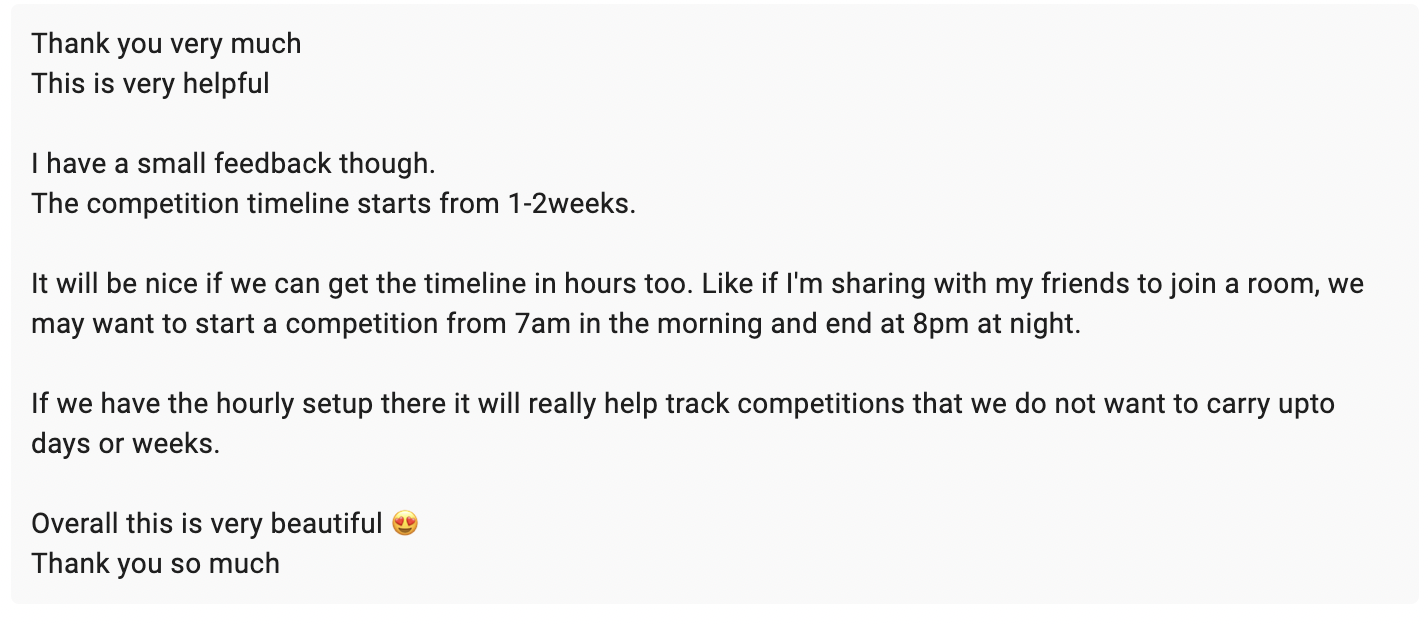
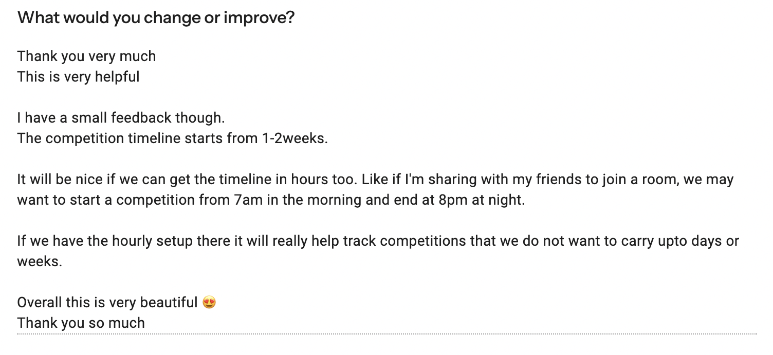
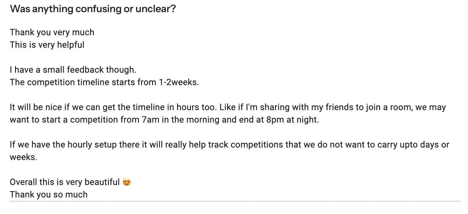
"The competition timeline starts from 1–2 weeks. It will be nice if we can get the timeline in hours too — like if I'm sharing with my friends to join a room, we may want to start from 7am and end at 8pm. Overall this is very beautiful 😍"
"As a recovering lazy person — we do weekly reports in our office. I want to know and document what I was able to do in a day/week. Can we have a place where it asks for a one-liner on tasks at the end of the day and automatically does a weekly recap for us?"

Week one, zero paid promotion.
A +67 Proof of Usefulness score.
A newly launched product growing entirely through organic sharing — scored on real usage, not vanity metrics or valuation.
Read the writeup →172 rooms created.
Outdo is only useful when another person is in the room with you. A room isn't a passive signup — it's a deliberate act of pulling someone else in. Every one of those 172 rooms means a user understood the product well enough to immediately want to share it, and had someone specific in mind. That's the core behavioral loop working, and it's the metric I'd optimize before anything else.
What I learned from building and shipping this.
Treating the behavioral mechanic as the product, not a feature. Scoping ruthlessly around the core loop and shipping nothing that didn't serve it. Distribution baked into the product itself: 172 rooms in week one with zero paid promotion validated that the sharing mechanic was working as designed.
Going in, I'd assumed the competitive angle might be a turnoff for some users. The interviews pushed back on that. For the people I was designing for, mild competition wasn't anxiety-inducing, it was motivating, and they already sought it out informally. That gave me confidence to lean into the leaderboard as the central UI element rather than softening it into a "progress tracker."
More time on onboarding. The first 60 seconds assume you understand the mechanic. Most people don't. They need one moment that makes the "someone is watching you" element click. Not a tutorial. A feeling. I'd also design more intentionally for the empty room state: joining a room alone breaks the premise, and I'd want that moment to feel like anticipation, not abandonment.
When you design something you can't build, you end up designing things that don't account for how systems actually behave: how data flows, what latency feels like, what happens in edge cases. You design for the happy path. Building it yourself forces you to confront the real experience, because you're the one implementing every decision you make.